If you're into AI tools, you've likely come across Nano Banana Pro. It's Google's new image generator from late November 2025, built on Gemini 3 Pro. The big deal? It creates stunning NanoBanana Pro infographics with clear text, accurate details, and no weird glitches.
I got excited about this because designing infographics used to take hours in tools like Canva or Photoshop. Now, with the right Nano Banana Pro infographic prompt, you can whip up something polished in seconds. Let's explore how to make infographics with NanoBanana Pro and learn some inspiring Nano Banana Pro infographic prompt!
What Makes Nano Banana Pro So Great for Infographics?
Nano Banana Pro launched in late November 2025, and it's built on top of Gemini 3 Pro. That means it has strong reasoning skills and connects to real-world knowledge through Google Search. When you ask it to create an infographic, it pulls in facts, gets layouts right, and renders text perfectly in different languages and styles.
Compared to Nano Banana, the Pro version significantly improves reasoning accuracy, data understanding, and visual consistency, making it better suited for professional-grade infographics.

People love it for things like:
-
Turning notes into roadmaps
-
Visualizing stats for reports
-
Creating educational explainers
-
Making social media posts that stand out
The key? It avoids those cluttered, over-the-top designs you sometimes get from basic prompts.
How to Make Infographic with Nano Banana Pro?
-
Go to gemini.google.com and select the Thinking model (powered by Gemini 3 Pro for Nano Banana Pro).
-
Copy a prompt below.
-
Replace [TOPIC] or bracketed parts with your details.
-
Add specifics like data points or brand colors for even better results.

15 Ready-to-Use Nano Banana Pro Infographic Prompts
Collection 1: The Corporate & Professional Suite
Best for: Reports, LinkedIn posts, pitch decks, and business summaries.
1. The Clean Minimalist Data Story
Style: Lots of white space, simple icons, professional feel.
Create a vertical infographic about [TOPIC]. Use a clean minimalist style with 5 clearly separated sections. Apply strong visual hierarchy with clear headings, simple line icons, neutral colors such as gray and soft blue, modern sans-serif typography, and generous white space. Keep everything tidy and distraction-free.
2. The KPI Dashboard Look
Style: Modern dashboard, charts and metrics.
Design a corporate KPI dashboard-style infographic for [TOPIC]. Use a grid layout with 6 metric cards. Include bar charts, key numbers, and percentage highlights. Dark background with blue and green accents. Clean, modern UI feel with legible dashboard-style fonts.
3. The Timeline Roadmap
Style: Milestone-based, easy to follow progression.
Generate a horizontal roadmap infographic for [TOPIC]. Show a clear left-to-right timeline with 6 milestones. Each milestone includes an icon, a date, and a short description. Use clean lines, a professional blue-to-purple color transition, and crisp vector visuals.
Collection 2: The Editorial & Bold Suite
Best for: Blog articles, newsletters, and social media that needs to grab attention.
4. The Magazine Spread Vibe
Style: High-impact, asymmetrical, bold text.
Create a bold editorial-style infographic about [TOPIC]. Use a magazine spread layout with oversized headline typography, strong color blocks in red and white, asymmetrical composition, collage-like elements, and abstract shapes. Add a subtle grain texture to give it a printed editorial feel.
5. The Dark Mode Tech Explainer
Style: Futuristic, neon accents, developer-friendly.
Design a dark mode tech explainer infographic for [TOPIC]. Use a deep black background with neon cyan and magenta accents. Thin glowing lines, glass-style panels, monospaced fonts, and a sleek schematic look. Clean, technical, and modern.
6. The Gradient Funnel Flow
Style: Smooth gradients, marketing funnel shape.
Create a vertical funnel infographic for [TOPIC]. Funnel shape should be wide at the top and narrow toward the bottom with 5 distinct stages. Use smooth mesh gradients in modern brand-style colors, clear side labels, and a polished glossy 3D appearance.
Collection 3: The Educational & Friendly Suite
Best for: Tutorials, school materials, and easy-to-understand guides.
7. The Soft Pastel Explainer
Style: Warm, approachable, hand-drawn touch.
Create a friendly educational infographic explaining [TOPIC]. Use soft pastel colors like mint, peach, and lavender. Rounded shapes, simple illustrations, vertical step-by-step flow, and bubble-style headers. Keep the tone approachable and easy to follow.
8. The Step-by-Step Process
Style: Clear flow, icons for each stage.
Design a process infographic for [TOPIC]. Use an S-curve layout flowing down the page with 6 steps. Each step includes a flat icon, short label, and brief explanation. Bright accent colors on a white background with dotted connectors and bold step numbers.
9. The Cycle Diagram
Style: Circular, holistic view.
Create a circular cycle infographic for [TOPIC]. Place the core concept in the center with 6 surrounding segments. Use clockwise arrows to show flow. Flat colors, simple icons, and a precise, balanced layout.
Collection 4: The Creative & Conceptual Suite
Best for: Brainstorming, ideas, and unique visuals.
10. The Hand-Drawn Sketchnote
Style: Casual notebook doodles.
Create a sketchnote-style infographic for [TOPIC]. Use a textured paper background, hand-drawn marker lines, arrows, circled keywords, and casual handwriting-style fonts. Keep it loose, visual, and creative.
11. The Mind Map Branches
Style: Organic connections, bubbles.
Design a mind map infographic for [TOPIC]. Central idea in the middle with branching colored nodes. Use curved connecting lines, icons inside bubbles, a clean white background, and an organic, flowing structure.
12. The Comparison Split
Style: Side-by-side, clear pros and cons.
Create a two-column comparison infographic showing [OPTION A] versus [OPTION B]. Use a perfectly symmetrical split layout with different color themes on each side. Include simple icons such as check marks and crosses, concise bullet points, and a flat modern design.
Collection 5: The Fun & Viral Suite
Best for: Social posts, hooks, and playful content.
13. The Icon Grid Facts
Style: Bento box tiles, quick and snackable.
Create a 3 by 3 grid infographic for [TOPIC]. Each tile contains one large flat icon and a short bold caption. Use soft pastel backgrounds, dark icons, and a playful yet polished tech-inspired illustration style.
14. The Pyramid Hierarchy
Style: Layered levels, gradient build.
Design a pyramid infographic for [TOPIC]. Use 5 stacked layers, transitioning from darker tones at the base to lighter tones at the top. Add floating labels connected with thin lines, a subtle patterned background, and clean geometric shapes.
15. The Retro Poster Twist
Style: Vintage feel, bold and nostalgic.
Create a vintage poster-style infographic about [TOPIC]. Use Art Deco inspired typography, flat geometric shapes, earthy color tones, and a screen-printed texture. Keep the layout bold, simple, and nostalgic.
Essential Tips for Mastering Nano Banana Pro Infographics
Here are some straightforward tips that can really help you get consistent, high-quality results without much hassle.
1. Set the Aspect Ratio First
Gemini generates square images by default. For infographics, 9:16 works best for mobile and Pinterest, while 16:9 is better for presentations, timelines, and wide comparisons. Defining the aspect ratio early keeps spacing balanced and avoids cramped layouts.
2. Stay Under 400 Words
For clear text and minimal errors, keep all on image text under 400 words. Results are noticeably more stable within this range. Exceeding it often leads to awkward spacing or small text glitches. When more explanation is needed, splitting content into multiple infographics works better.
3. Fix Spelling Instead of Regenerating
Gemini 3 handles spelling well, but occasional mistakes still happen. When a headline is incorrect, regenerating the entire image is unnecessary. Using the edit tool to replace the exact wording is faster and more reliable.
4. Know When Watermarks Appear
Free or basic access includes a small Gemini watermark in the corner. Gemini Advanced or Pro allows watermark free infographics, especially when using Canvas mode.
5. Use Google AI Studio for Final Outputs
For high importance visuals, Google AI Studio delivers better results. It supports higher resolutions such as 2K or 4K, offers stronger factual accuracy through search grounding, and removes watermarks. The cost per image is low compared to the quality gain.
6. Format Data as Bullets or Quotes
When an infographic includes numbers or statistics, listing them as bullet points or quoted text inside the prompt improves placement accuracy and reduces formatting errors.
7. Reuse a Style Reference
Uploading a reference image or brand guide helps maintain visual consistency. Instructing the model to follow the same style produces more reliable results than describing colors and fonts each time.
8. Let the Model Suggest the Layout
When layout direction is unclear, asking the model to suggest an appropriate infographic style often leads to cleaner and more logical designs.
Final Thoughts on Nano Banana Pro Infographics
Honestly, Nano Banana Pro has made creating infographics fun again. No more struggling with design software or settling for okay results. With smart Nano Banana Pro infographic prompts, anyone can produce stuff that looks like it came from a pro designer.
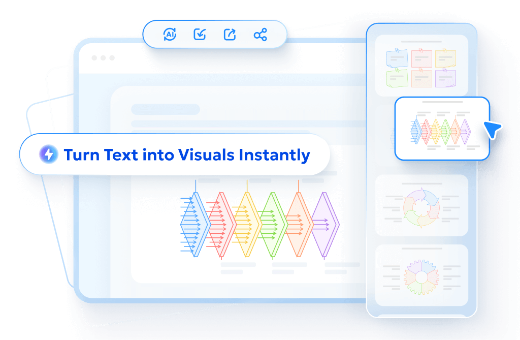
Make infographic Easier with Diagrimo

There is also a simple way to make infographics easier before jumping into visual generation. Diagrimo can quickly turn plain text into clear diagrams. No prompt writing is needed. Just paste the content and it converts it automatically. This works especially well at the early stage. Rough notes, paragraphs, or outlines can be turned into visual structure right away.
Here's how to do it:
-
Paste notes or text into Diagrimo and select the part you want to visualize.
-
Click the Visualize button on the left to generate a diagram automatically.
-
Diagrimo chooses a layout and style that fit the content.
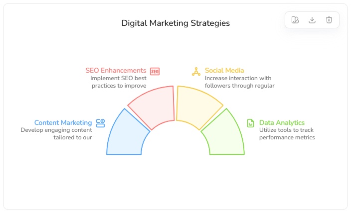
-
The diagram can be customized by switching styles, changing chart types, and editing text nodes.
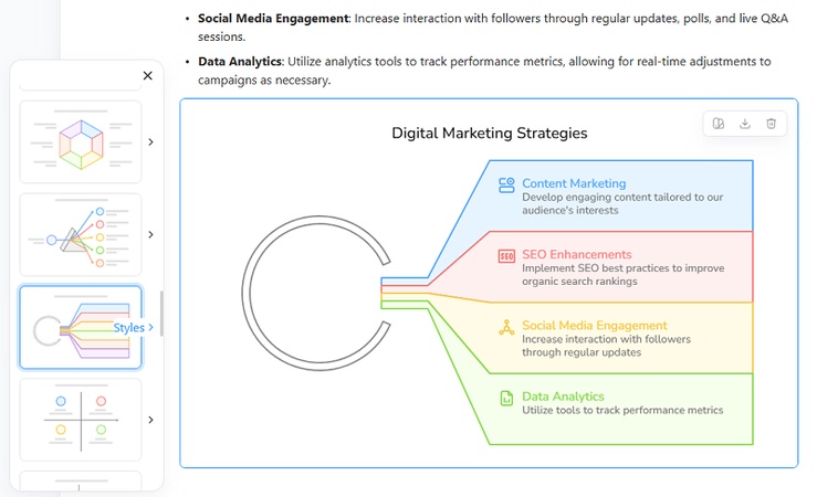
-
Once finished, the diagram can be copied or exported for use in an infographic.


Conclusion
Nano Banana Pro makes it much easier to turn ideas into polished infographics, especially when the structure is clear. With the right prompts, complex information can be visualized quickly and cleanly.
To make the process even smoother, our AI infographic generator helps at the step before design. By converting text directly into diagrams without writing prompts, the structure is ready first. This makes generating the final infographic faster and more reliable.
- AI text-to-visuals turns ideas into diagrams or infographics.
- Customizable styles match your brand and presentation tone.
- Share anytime by exporting in various formats and a link.
- No design skills needed for presentations, teaching, or reports.