The world of AI image editing has been buzzing lately, especially with Google Gemini's new Nano Banana tool going viral. It's not just another filter; creators are using it to make surreal 3D figurines, to restyle photos, and experiment with hybrid visual styles. With all this hype, it got me thinking: What if we used nano banana as tools to create infographics? Could something playful, unexpected, and visually quirky like nano banana make data visuals more memorable?
In this article, I'll explore that idea. I'll show how nano banana can bring creativity and visual interest to infographics, walk you through how to do it, and share 10 real examples to illustrate what works and what to watch out for.
The Creative Spark: Infographics with Nano Banana
Nano Banana images have many advantages that make them surprisingly useful in infographic design. They're rich in detail, have deep colors, are highly legible, are easily editable and adaptable, and have a consistent style that's easy to maintain. These qualities meet the key criteria for a great infographic:
-
Clear and readable information
-
Consistent style and color palette
-
Scalability for different formats
-
Flexibility to adapt across designs
By combining these advantages with the needs of an infographic, using the nano banana image becomes a reasonable and even potentially effective design choice.
Step-by-Step Guide: How to Create Infographics with Nano Banana
-
Step 1: Define Your Idea
Decide what type of infographic you want to create, whether a timeline, comparison chart, mind map, or category chart. Gather the information or data you plan to visualize.
-
Step 2: Generate Your infographic
Go to Google Gemini, select Create images, and enter the prompts for the infographic you want to generate.
-
Step 3: Check for Accuracy
Carefully review your infographic. If the information and visuals are accurate, your design is complete.

10 Creative Infographic Examples Using Nano Banana
Example 1: Skill Growth Journey Timeline
"Generate a timeline infographic showing the skill growth path from beginner to expert."

This infographic demonstrates progression visualization using a curved path design. The journey from "Beginner" to "Expert" is mapped across five distinct stages, each with unique colors and icons. The curved path mimics natural growth patterns, making the abstract concept of skill development tangible and relatable. However, the descriptive text for each stage is cramped and creates inconsistent spacing, while the background icons appear decorative rather than functional.
Example 2: Remote vs. Office Work Comparison
"Create an infographic comparing the pros and cons of remote work vs. office work"

This comparison infographic uses a balanced layout with contrasting colors (blue vs. orange) to clearly distinguish between remote and office work scenarios. The clear visual separation makes complex workplace decisions as simple as choosing between two distinct options. The design has a critical flaw where the office work section shows "CONS" for both positive and negative aspects, creating confusion about which points are actually benefits.
Example 3: Learning Efficiency Curve
"Draw a curve trend information chart to show how learning efficiency changes with practice time"

This data visualization showcases the relationship between practice time and learning efficiency using a smooth curve graph. The smooth curve transforms abstract learning theory into an easily understood visual pattern. The chart has duplicate x-axis values (showing "10" and "15" twice), which undermines data credibility and suggests careless execution.
Example 4: Technology Evolution Timeline
"Create an infographic that shows the gradual impact of technological development on daily life."

This horizontal timeline traces technology's impact across five decades, using era-specific colors and icons. Complex technological history is simplified into digestible time periods with immediately recognizable visual cues. The text content varies dramatically between sections, with some eras having extensive descriptions while others remain sparse, creating visual imbalance.
Example 5: Productive Person's Daily Schedule
"Create an infographic showing a productive person's typical day."

This daily timeline infographic segments a 24-hour period into productivity phases using color-coded time blocks. The day's complexity is reduced to a simple, replicable visual pattern that anyone can follow. The schedule presents an unrealistically rigid structure that may discourage readers, and the time allocations don't account for individual differences in energy levels or work demands.
Example 6: Digital Tools Categories
"Generate an infographic that illustrates the main categories of digital tools used by modern people in their daily lives (work, entertainment, socializing, learning)."

This categorical infographic organizes digital tools into four main life areas using distinct color coding. The overwhelming world of digital tools is simplified into four essential life categories. The tool listings are inconsistent in length and specificity, with some categories appearing more comprehensive than others, and several examples are already becoming dated.
Example 7: Problem-Solving Process Flow
"Design an infographic that shows the process from problem discovery to solution, divided into 5-6 steps."

This process infographic uses a flowing, connected design to show the problem-solving journey. Complex problem-solving methodology becomes a simple, followable recipe for success. The linear progression oversimplifies real problem-solving, which typically involves iterations, setbacks, and non-sequential approaches, making this appear overly prescriptive.
Example 8: Exercise Decision Tree
"Design a decision tree infographic to help users make choices based on different conditions."

This decision tree guides users through exercise choices using conditional logic and branching paths. Exercise selection complexity is reduced to a simple series of binary choices. The branching becomes visually chaotic in the lower section, with overlapping paths and inconsistent spacing that makes it difficult to follow the decision logic clearly.
Example 9: AI Development Timeline
"Generate an infographic showing the development of artificial intelligence: from the Turing test in 1950 to the outbreak of generative AI in 2025, using a horizontal timeline to mark key years and major events."

This comprehensive timeline charts 75 years of AI development using a horizontal progression. Decades of complex AI research are distilled into key breakthrough moments anyone can understand. The timeline shows disproportionate spacing, with recent developments receiving much more visual weight than foundational early work, and the 2025 "prediction" is presented as historical fact.
Example 10: Energy Source Classification
"Design an infographic to show the classification of different energy sources: fossil energy, nuclear energy, and renewable energy (solar energy, wind energy, and hydropower). Each category should be accompanied by an icon and a sentence with its characteristics."

This classification infographic categorizes energy sources into three main types with clear visual distinction. Complex energy policy and environmental science concepts are simplified into three easily understood categories. The renewable energy section is visually overloaded with multiple colored blocks while other sections remain sparse, creating obvious bias, and the characterizations are overly simplified for such complex topics.
Understanding Nano Banana Limitations and Best Practices
Our 10 examples reveal that while nano banana tools are useful for inspiration, they shouldn't be treated as complete infographic solutions.
Limitations of Nano Banana Infographics
-
Labeling & Accuracy Issues: Frequent mistakes like duplicate axis values or incorrect labels undermine credibility.
-
Poor Visual Balance: Uneven distribution of information causes weak hierarchy and confusion.
-
Oversimplification: Complex topics often get reduced to overly simple categories, losing nuance.
-
Design Inconsistencies : Spacing problems, overlaps, and chaotic layouts require manual fixes.
-
Bias Risks: Certain categories may be emphasized visually, regardless of data importance.
Best Practices
-
Use outputs as inspiration, not final products.
-
Verify all data and logical flow before sharing.
-
Rebalance visuals to reflect true importance.
-
Add context for complex or sensitive topics.
Final Thoughts
Creating effective infographics means balancing visual appeal with clarity, and the nano banana approach shows how simplifying complex ideas makes messages more accessible. The ten examples highlight different storytelling formats, from timelines to decision trees, each designed to engage while informing. Ultimately, great infographics come from iteration, testing, refining, and responding to feedback until they both inform and inspire action.
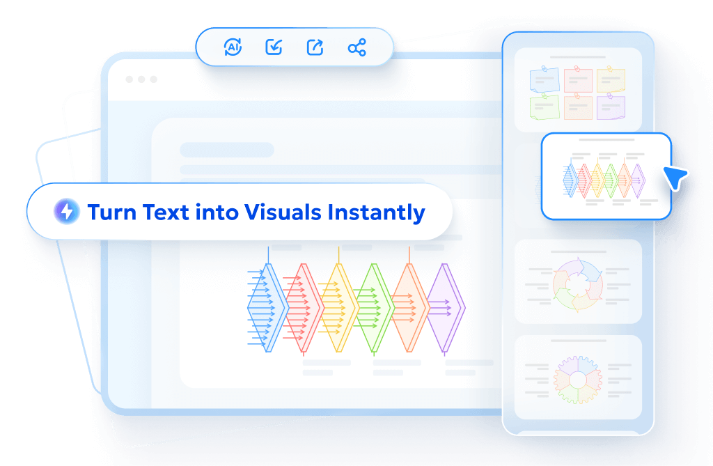
- AI text-to-visuals turns ideas into diagrams or infographics.
- Customizable styles match your brand and presentation tone.
- Share anytime by exporting in various formats and a link.
- No design skills needed for presentations, teaching, or reports.
FAQs
Can I use nano banana infographics for professional presentations?
Yes, but with care. Keep the banana motif subtle if the setting is formal, and always double-check the accuracy of data and labels.
How do I make sure nano banana infographics stay accurate?
Manually verify all numbers, labels, and timelines. AI tools often produce errors like duplicate values or mismatched labels, so fact-checking is essential.
Which platform is best for generating nano banana infographics?
Google Gemini is currently the most versatile option for generating creative nano banana visuals, though final editing is best done in design software like Canva, Figma, or Illustrator.
Are nano banana infographics just for fun, or can they be practical?
They can be both. While the banana motif adds humor and novelty, the core design principles of clarity, hierarchy, and balance still apply, making them practical in many contexts.
How can I avoid common design flaws with nano banana infographics?
Keep layouts balanced, simplify branching structures, and avoid overloading sections with too much text or decoration. Always adjust AI outputs to ensure readability and fairness in representation.
