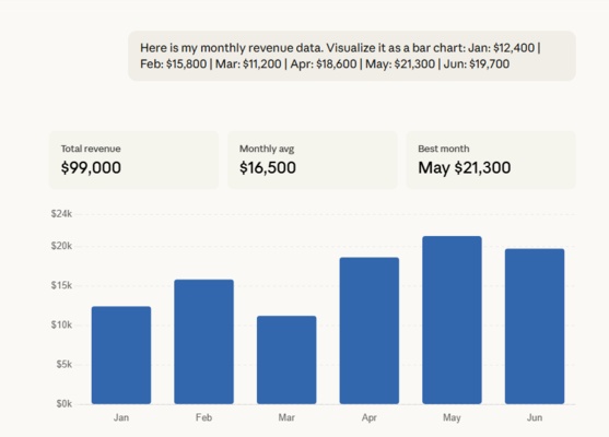
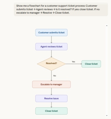
AI assistants are no longer limited to text. Claude can now generate charts, diagrams, and interactive visuals directly inside a conversation - no code, no extra tools, no setup required. Whether you need a flowchart, a bar chart, or an architectural diagram, Claude data visualization capabilities make it possible in seconds.
This Claude data visualization tutorial covers everything: what changed, how to use it, a dedicated tool worth trying, and how Claude compares to ChatGPT's own visual update.
What's New: Claude Can Now Visualize Data in Chat
Anthropic updated Claude to generate interactive charts, diagrams, and visualizations inline during a conversation. Unlike traditional image generation, these visuals are built using HTML and SVG, the same building blocks used for web pages, making them faster to load, scalable across screen sizes, and interactive.
What Claude Can Generate
Availability
-
The feature is available on all plan types. No items needed to turn on. Claude
-
Currently in beta, with some visual formats limited to desktop. Not yet available on mobile.
-
The update expands on an earlier experimental project called "Imagine with Claude", introduced in late 2025.
How to Generate Charts and Diagrams in Claude
-
Step 1: Open Claude
Go to claude.ai on web or desktop. No extra settings to enable.
-
Step 2: Describe Your Data or Concept
Type your request in plain language. You can paste raw numbers, describe a workflow, or upload a CSV file.
-
Step 3: Ask for a Specific Visual Type
If Claude gives a text response, rephrase your request to specify the visual format you want.
-
Step 4: Interact and Iterate
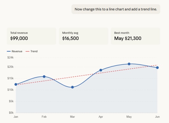
Once a visual appears, you can interact with it, click buttons, adjust sliders, expand it to full screen, and keep asking follow-up questions. Claude can update or rebuild the visual as the conversation continues.
-
Step 5: Save Your Visual
You have a few options:
-
Copy as an image for a static snapshot
-
Download as an SVG or HTML file
-
Save as an artifact to keep, publish, and iterate on over time
-


If you tell Claude, "Make all my visualizations blue and white," Claude will remember your preference throughout the session. Also, Opus performs best at visualization tasks - for complex visuals, choose a more intelligent model.
Meet Diagrimo: Turn Text Into Visuals Instantly

Claude AI data visualization works great inside a conversation, but when you need polished, exportable diagrams, Diagrimo is worth trying.

Diagrimo is an AI-powered visualization tool from Tenorshare AI that enables users to instantly turn text into clean, structured visual diagrams. Whether organizing thoughts, planning projects, or explaining complex concepts, Diagrimo makes visual thinking effortless and intuitive.
Key Features
Claude vs. ChatGPT: Which AI Visualizes Better?
Both Claude and ChatGPT launched visual capabilities within days of each other in March 2026. But they serve very different purposes. Here's a clear breakdown.
The Core Difference
How ChatGPT's Visual Learning Works
OpenAI introduced dynamic visual explanations, a new ChatGPT feature that allows users to see how formulas, variables, and mathematical relationships change in real time. Instead of just reading an explanation or looking at a static diagram, users can now engage directly with interactive visuals.
The feature currently supports more than 70 topics across mathematics and science, including compound interest, Coulomb's law, exponential decay, Hooke's law, linear equations, kinetic energy, and Ohm's law.
Side-by-Side Comparison Prompts
Use these prompts on both Claude and ChatGPT and compare the results:
Test 1: Compound Interest Chart
Visualize compound interest growth on a $10,000 investment at 7% annual return over 30 years. Show yearly values.
Claude Outpuut:

ChatGPT Output:

Test 2: Pie Chart (Market Share Data)
Create a pie chart showing global smartphone market share: Samsung 22%, Apple 18%, Xiaomi 13%, OPPO 9%, Vivo 8%, Others 30%.
Claude Outpuut:

ChatGPT Output:

Test 3: Timeline Diagram
Create a timeline of major AI milestones: 2017: Transformer model introduced, 2020: GPT-3 launched, 2022: ChatGPT released, 2023: GPT-4 launched, 2024: Claude 3 launched, 2025: Claude 3.7 launched, 2026: Claude adds inline visuals.
Claude Outpuut:

ChatGPT Output:

Verdict
-
Visual quality: Claude produced more polished, structured visuals across all three tests. ChatGPT handled data accurately but leaned toward basic analytical output.
-
Interactivity: Claude's charts include adjustable sliders and clickable elements. ChatGPT's visuals are largely static.
-
Diagram ability: Claude generated a fully structured, color-coded timeline. ChatGPT returned a scatter plot with overlapping text labels.
-
Bonus feature: Clicking on each node in Claude's timeline triggers a detailed explanation of that milestone - a level of interactivity ChatGPT does not offer.
-
Bottom line: For general-purpose data visualization, Claude is the stronger choice.

The release comes just days after OpenAI made ChatGPT capable of generating interactive visuals when explaining science and math concepts - signaling that both companies see visual AI as the next frontier, just with different entry points.
Final thoughts
Claude's ability to generate charts and diagrams directly in chat makes data visualization more accessible than ever. Use this guide as your Claude data visualization library of prompts and references to get started quickly. Whether you're a business analyst, educator, or everyday user, the combination of Claude for conversational visuals and Diagrimo for polished, exportable diagrams covers most use cases end to end.
As both Claude and ChatGPT continue to push visual AI forward, the gap between text-based and visual-first AI experiences is closing fast. Now is a great time to start experimenting.
- AI text-to-visuals turns ideas into diagrams or infographics.
- Customizable styles match your brand and presentation tone.
- Share anytime by exporting in various formats and a link.
- No design skills needed for presentations, teaching, or reports.
FAQs
Is Claude's data visualization free?
What types of visuals can Claude generate?
-
Can I upload my own data for Claude to visualize?
How do I save a visual generated by Claude?
What is Diagrimo?
-
How is Claude different from ChatGPT for visualization?
Yes. The feature is currently in beta and available to all plan types, including free users.
Bar charts, line graphs, pie charts, flowcharts, timelines, system architecture diagrams, and more.
Yes. Upload a CSV file or paste raw data and ask Claude to chart it.
You can copy it as an image, download it as an SVG or HTML file, or save it as an artifact.
Diagrimo is an AI-powered tool by Tenorshare AI that converts text into structured visual diagrams. It supports PNG export and link sharing.
Claude excels at general-purpose visuals with strong interactivity. ChatGPT's visual feature focuses on interactive STEM learning across 70+ fixed topics.
