If you've used NotebookLM to generate infographics before, you know the frustration: every output came out in the same default layout, no matter what your content actually needed. That changed on March 3, 2026, when Google rolled out a custom infographic style selector with 10 distinct visual presets.
This article breaks down what changed, what each style does, and how to push the tool further than its built-in presets allow.
What Is the NotebookLM Infographic Styles Update?
What Google Actually Added
On March 3, 2026, Google officially added a "Choose Visual Style" feature to NotebookLM's Studio panel. The update came alongside slide revision capabilities, Cinematic Video Overviews, and EPUB file support.

Here's a quick summary of what the infographic update includes:
-
10 preset infographic styles, each with its own layout, icon design, and visual tone
-
An "Auto" option that lets NotebookLM pick the best style based on your content
-
Orientation control: Square, Portrait, or Landscape
-
Detail level: Concise, Standard, or Detailed (beta)
-
A custom description field: type in specific instructions about color, focus, or style
How to Access the Feature
-
Open any notebook in NotebookLM
-
Click the pencil icon next to the infographic button in the Studio panel
-
A "Choose Visual Style" panel appears with all 10 options
-
Select your style, adjust orientation and detail level, and add any custom description
-
Hit Generate

this feature is available only to users aged 18 and over, and it's still rolling out in phases. Some accounts may not see it yet depending on region and account type.
All 10 NotebookLM Infographic Styles Explained (With Examples)
Here's a full breakdown of every style currently available, what it looks like, and when to use it.
1. Instructional
Best for: Step-by-step guides, tutorials, how-to content, process documentation
Organizes content into numbered steps with arrows and clear section breaks. Built for situations where sequence matters. If you're summarizing a workflow, a study method, or any process with a logical order, this is the obvious choice.

2. Professional
Best for: Business reports, work presentations, formal documentation
Clean typography, structured columns, and a restrained color palette. It looks like something you'd see in a corporate deck or an executive summary. Not the most exciting option visually, but the most credible-looking when the audience matters.

3. Sketch Note
Best for: Study notes, brainstorming, concept explanations, casual learning
Mimics hand-drawn diagrams: rough lines, simple illustrations, and connecting arrows that look like they came from a whiteboard. It's the most human-feeling style in the set, and one reviewer noted it best balances "fun and professional without leaning too hard into either direction."

4. Scientific
Best for: Research summaries, academic content, technical explanations
Think textbook layout: structured diagrams, proportion indicators, and organized data blocks. It doesn't try to be pretty. It tries to be accurate and easy to scan. Ideal for biology, chemistry, economics, or any content with real analytical structure.

5. Kawaii
Best for: Social media visuals, beginner-friendly content, informal topics
Soft colors, cute icons, and a lighthearted aesthetic inspired by Japanese design culture. Genuinely fun for content aimed at younger readers or casual sharing. Less suited for anything that needs to feel authoritative.

6. Anime
Best for: Creative presentations, storytelling, engaging informal visuals
Takes visual elements and turns them into expressive characters. Sun and moon icons become anime figures. Concepts get personified. Very effective for engagement, and less appropriate for formal contexts.

7. Clay
Best for: Educational visuals, simplified concept explanations, approachable design
Clay-style 3D rendering gives everything a soft, rounded, tactile look. Friendly and non-intimidating. A solid middle ground between polished and playful for general audiences.

8. Editorial
Best for: Article summaries, opinion pieces, long-form content highlights
Borrows from magazine and newspaper layouts: heavy text weighting, column structures, and aged-paper textures. The most "storytelling" style in the set. Works best when your content has a narrative arc rather than just a list of facts.

9. Bento Grid
Best for: Product features, multi-topic breakdowns, structured content with clear sections
Arranges content into modular boxes, similar to the bento box aesthetic that's been popular in UI design. Each section gets its own cell. Great for "X things you need to know about Y" type content.

10. Bricks
Best for: Complex topic breakdowns, dynamic multi-section content
Arranges content in staggered, offset blocks rather than a strict grid. Feels more dynamic than Bento Grid while staying organized. A solid pick for content with multiple equal-weight points that don't follow a sequence.

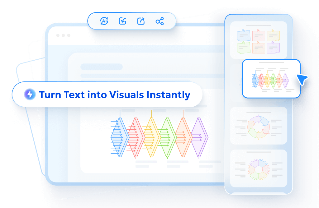
Want More Control Over Your Visuals? Try Diagrimo

NotebookLM's infographic output is a static PNG. You can't edit text, move elements, or adjust the layout after generation. If the result isn't right, you start over.
That's where Diagrimo fills the gap. It's a text-to-visual tool that turns plain language into clean, beautiful diagrams and infographics, with full control over the result. Unlike NotebookLM, it gives you:
-
Live editing so you can tweak visuals without regenerating from scratch.
-
A range of visual formats: timelines, mind maps, comparison charts, infographic layouts, and more.
-
Full creative control over layout, color, and structure.
-
Export-ready outputs for presentations, documents, or social sharing.
If you use NotebookLM for research and summaries, Diagrimo is the natural next step when you need something that looks exactly the way you imagined it.
Go Beyond NotebookLM: Create Styles It Can't Generate
NotebookLM's 10 presets are a solid starting point, but they don't cover every visual style. The good news: its custom description field is more powerful than most users realize, and any AI tool can help you unlock it.
Use Any AI to Generate Your Style Prompt
The core technique works the same regardless of which AI you prefer. Find a reference infographic whose visual style you like, upload it to an AI, and ask it to describe the style as a prompt you can paste directly into NotebookLM.
Here's how:
-
Find any infographic image whose visual style appeals to you
-
Upload it to ChatGPT, Claude, Gemini, or any multimodal AI
-
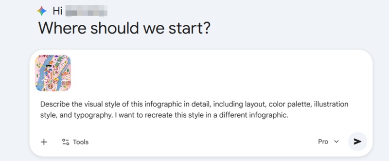
Ask: "Describe the visual style of this infographic in detail, including layout, color palette, illustration style, and typography. I want to recreate this style in a different infographic."
-
Copy the output and paste it into NotebookLM's "Describe the infographic you want to create" field
-
Generate

7 Ready-to-Use Custom Style Prompts
1. Mini World (Voxel)
A charming miniature voxel world style with geometric blocky shapes and characters, 2.5D depth, bright saturated colors, and a playful toy-like aesthetic. Each concept is represented as a tiny scene or object built from cubes.
2. Chalkboard
A textured chalkboard art style on a dark background with dusty white and colored chalk illustrations, hand-lettered titles, rough sketch icons, and a rustic classroom feel. Use warm accent colors like yellow and orange chalk.
3. Whiteboard
A clean instructional whiteboard style with marker-style lines in simple primary colors, dry-erase texture, hand-drawn arrows and icons, and a bright white background. Casual and approachable, like a live teaching session.
4. Flat Design 2.0
A sleek flat design 2.0 style with simple vector shapes, subtle gradients for depth, high-legibility typography, generous white space, and a modern minimal color palette. Clean, professional, and easy to scan.
5. Exploded View
A detailed exploded-view technical illustration where object components float disconnected yet spatially arranged around a central axis, with numbered callouts, fine line art, and a neutral technical background.
6. Map Style
An adventurous geographic map style with path-based layouts, hand-drawn landmark icons, elevation markers, aged parchment or flat digital textures, and a journey-like visual narrative connecting each content point.
7. Detective "Murder Board"
A gritty detective murder board style with pinned polaroid-style photos, red string connections between concepts, newspaper clippings, handwritten notes, and a cork board texture background. Suspenseful and investigative in tone.
Final thoughts
The March 2026 update gives NotebookLM real versatility for the first time: 10 style presets. If you're trying it for the first time, Sketch Note is the best starting point since it works across almost any content type. When the built-in styles aren't enough, Diagrimo is worth your time. Describe what you want, get a clean visual, and keep refining until it looks exactly right.
- AI text-to-visuals turns ideas into diagrams or infographics.
- Customizable styles match your brand and presentation tone.
- Share anytime by exporting in various formats and a link.
- No design skills needed for presentations, teaching, or reports.
FAQs
-
What are the 10 NotebookLM custom infographic styles?
Are the new styles available to all users?
-
Can I edit a NotebookLM infographic after generating it?
Which style works best for presentations?
-
What's the difference between Auto and choosing a style manually?
Sketch Note, Kawaii, Professional, Scientific, Anime, Clay, Editorial, Instructional, Bento Grid, and Bricks.
Available to users aged 18 and over. The rollout is global but may still vary by region and account type.
No. Outputs are static PNG files. For editable visuals, tools like Diagrimo let you create and adjust without starting over.
Professional and Bento Grid for formal decks. Instructional for process walkthroughs. Sketch Note or Clay for casual or educational presentations.
Auto lets NotebookLM pick based on your content. Manual selection gives you control over the look regardless of what the AI would have defaulted to.
