If you're trying to turn dense research into readable visual content, NotebookLM just made your workflow significantly easier. Instead of manually extracting key points and pasting them into a separate design tool, you can now generate visuals directly from your source material.
But getting the perfect output requires knowing how to ask for it. In this guide, we'll break down exactly how to use the latest features, share the best notebooklm infographic prompts for different use cases, and give you a few tricks for nailing the perfect aesthetic.
NotebookLM Infographic Update: Custom Visual Styles
Google rolled out an update giving users control over their generated visuals. You'll notice that notebooklm infographic styles are now a native feature with exactly 10 distinct preset options in the built-in notebooklm infographic style library: Sketch Note, Kawaii (a fan favorite), Professional, Scientific, Anime, Clay, Editorial, Instructional, Bento Grid, and Bricks.

Best NotebookLM Infographic Prompts by Infographic Type
The default presets like Bento Grid or Instructional are great, but the real magic happens when you pair them with specific instructions tailored to your format. Here are a few reliable prompts based on what you are trying to build. You can treat the resulting output as a foundational NotebookLM Google infographic template to iterate on.
Infographic Poster
Best for: summaries, awareness campaigns, event highlights.
Try this prompt for NotebookLM for infographic poster creation:
Create a bold, visually striking poster-style infographic. Use large typography for the key headline, limit text to 3-5 supporting points, and make the layout easy to read at a glance. Landscape orientation, detailed level.

The Editorial or Kawaii style works especially well here depending on your audience - Editorial for professional contexts, Kawaii for a more approachable, shareable feel.
Timeline / Process Flow
Best for: step-by-step guides, historical overviews, how-it-works explanations.
Design a horizontal timeline infographic showing the sequence of events or steps. Use numbered stages, short labels, and connecting arrows. Keep text concise. Landscape orientation, standard detail.

Pair this with the Instructional style for maximum clarity, or Sketch Note if you want a more casual, hand-drawn look.
Comparison / Vs. Layout
Best for: product comparisons, pros vs. cons, option A vs. option B.
Create a side-by-side comparison infographic with two clearly labeled columns. Highlight key differences using icons or contrasting colors. Professional style, landscape orientation.

The Bento Grid style is a natural fit here - its modular tile layout handles side-by-side structures really well.
Data & Statistics
Best for: research summaries, reports, fact sheets.
Build a data-focused infographic that highlights key statistics and numbers prominently. Use charts or large numerals for impact. Scientific style, detailed level, landscape orientation.

Scientific is the obvious choice, but Professional works well if the output is going into a business presentation.
Educational / Explainer
Best for: onboarding materials, how-to content, study guides.
Create an educational explainer infographic with a clear title, short definitions, and visual examples for each concept. Use icons to support understanding. Portrait orientation, standard detail.
Instructional and Sketch Note are both strong picks for this type - the former for structured learning, the latter for a more engaging, visual-notes feel.
Social Media / Shareable Card
Best for: quick facts, tips, Instagram/LinkedIn posts.
Design a square-format infographic optimized for social sharing. Include one central message or stat, 5 supporting points max, and a clean background. Concise detail level.

Kawaii tends to perform well on social for lifestyle and consumer topics. For B2B content, Bento Grid gives a clean, modern look that works well on LinkedIn.
Document / Report Summary
Best for: condensing long PDFs or articles into a quick visual.
Summarize this document into a single-page infographic. Highlight the main argument, 3-4 key takeaways, and any notable data points. Use the professional style with a clean, corporate layout.
Professional or Editorial are the go-to styles here. If the source is academic or technical, Scientific is worth trying too.
Another AI Tool to Visualize Ideas: Diagrimo

NotebookLM is great for turning source documents into infographics - but it's built around uploaded sources. If you want to visualize ideas from scratch, or create diagrams and mind maps without a source document, Diagrimo is worth a look.

Diagrimo is an AI-powered diagram and visual thinking tool that lets you:
-
Generate flowcharts, mind maps, and org charts from text prompts
-
Edit visuals interactively without needing to re-prompt
-
Export in multiple formats for presentations or docs
-
Start from scratch - no source document required
NotebookLM Infographic Style Prompts You Can Try
A Simple Trick: Use Gemini to Reverse-Engineer Any Style
Here's one of the most underrated workflows for getting exactly the infographic style you want.
-
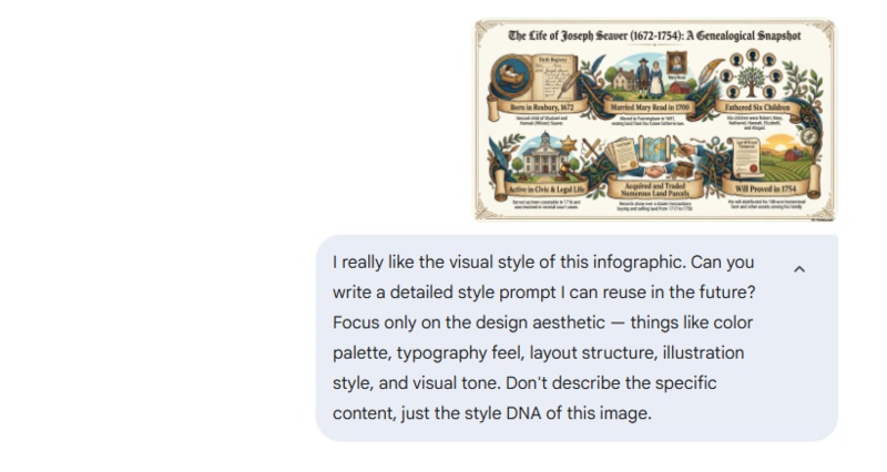
Step 1: Find an infographic you love - from Pinterest, Behance, or anywhere online. Then drop that image into Gemini and use this prompt:
 Prompt:
I really like the visual style of this infographic. Can you write a detailed style prompt I can reuse in the future? Focus only on the design aesthetic - things like color palette, typography feel, layout structure, illustration style, and visual tone. Don't describe the specific content, just the style DNA of this image.
-
Step 2: Gemini will return a style description you can paste directly into NotebookLM's custom description field. It's a fast way to match any visual reference without guessing.
This works especially well when none of the 10 presets - Sketch Note, Kawaii, Professional, Scientific, Anime, Clay, Editorial, Instructional, Bento Grid, or Bricks - quite match what you have in mind.
More Custom NotebookLM Infographic Style Prompts
The NotebookLM infographic style prompt field isn't limited to the preset options. Here are some styles you can describe yourself:
Retro / Vintage Print:
 Prompt:
Design in a retro poster style with muted earthy tones, serif typography, and a slight grain texture. Think mid-century print design with bold but worn colors.
Minimalist / Swiss Design:
Prompt:Use a strict grid layout with lots of white space, a single accent color, and clean sans-serif typography. No decorative elements - let the information breathe.
Dark Mode / Tech:
Prompt:Create a dark-background infographic with neon or bright accent colors (blue, green, or purple). Use monospace fonts for data points and a sleek, digital aesthetic.
Watercolor / Hand-Painted:
 Prompt:
Use soft watercolor washes as background elements, with hand-drawn-style icons and organic shapes. Warm color palette with natural tones. Friendly and approachable feel.
Isometric / 3D Flat:
 Prompt:
Design using isometric-style flat 3D illustrations. Each section should feel like a small scene viewed from a 45-degree angle. Bold outlines, clean fills, geometric consistency.
Bold Typographic:
Prompt:Let typography do the heavy lifting. Use oversized numbers and headline text as the primary visual element. Minimal illustration, high contrast, strong hierarchy.


Final thoughts
The March 2026 update makes NotebookLM's infographic feature genuinely worth using regularly. The 10 preset styles cover most use cases, and the custom description field gives you room to go further.
Start with a focused prompt, pick a style that fits your content, and iterate from there. When the presets don't cut it, use the Gemini trick to reverse-engineer a style you like. And if you need to visualize ideas beyond what a source document can offer, Diagrimo is a solid companion tool to have in your workflow.
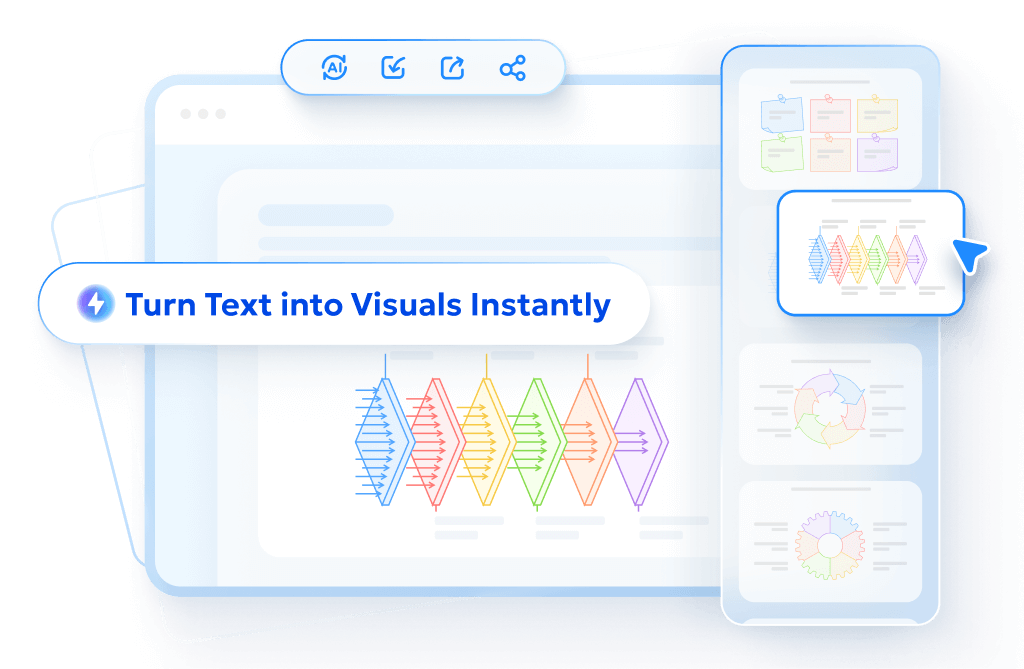
- AI text-to-visuals turns ideas into diagrams or infographics.
- Customizable styles match your brand and presentation tone.
- Share anytime by exporting in various formats and a link.
- No design skills needed for presentations, teaching, or reports.
FAQs
Can NotebookLM generate infographics?
-
What are the best NotebookLM infographic prompts?
What makes a good infographic example?
-
What should you avoid in infographic examples?
-
Does NotebookLM pull images from the web for these?
Yes. Upload a source document, open the notebook guide, and select the Infographic option. You can choose from 10 preset styles, set orientation and detail level, and add a custom description to refine the output.
The best prompts specify three things: layout type (poster, timeline, comparison), visual style (Professional, Editorial, Instructional, etc.), and detail level. Vague prompts produce generic results.
Clear hierarchy, one dominant message, and a layout that's readable within a few seconds. The best NotebookLM infographic examples pair a focused prompt with a well-structured source document.
Too much text, inconsistent fonts or colors, and a flat hierarchy where nothing stands out. Fewer, stronger points almost always work better than cramming everything in.
No, NotebookLM generates the visuals based on the custom styles and prompts you select, grounding the actual text and data in the documents you have uploaded to your specific notebook rather than pulling random web images.
