Every successful pitch deck, consulting report, or business proposal hinges on a single, pivotal moment: defining the gap between the current state and the desired future. This is the job of the PowerPoint problem solution slide. When executed well, this slide doesn't just display information; it persuades your audience that you understand their pain and possess the only logical cure.
However, creating the best problem solution slides often feels like a chore. Presenters struggle to balance text with visuals, often cluttering the screen or failing to create a clear visual narrative. Whether you are building from scratch or using AI tools to speed up the process, this guide will show you how to design slides that convert.
Anatomy of a High-Converting Problem-Solution Slide
Before you start formatting your slides, it helps to understand what makes a slide effective. If you study top-tier problem solution slide examples from successful startups like Airbnb or Uber, you will notice they all share a specific "anatomy" or visual hierarchy.

A high-converting slide usually contains three distinct components:
- The "Pain" Container:
This area clearly articulates the friction or challenge. It usually uses cool colors (like grey or blue) or "danger" colors (like red) to signify the issue.
- The Bridge:
A visual element, usually an arrow or a connecting graphic that implies movement. It suggests that the current state is not permanent.
- The "Gain" Container:
The solution area. This should look cleaner, brighter (often green or brand colors), and less cluttered than the problem side to subconsciously signal relief.
Manual Method: Building Slides Step-by-Step in PowerPoint
You don't need to be a graphic designer to build a professional slide. By using PowerPoint's native template system, you can create a polished Problem-Solution slide in just four steps.
-
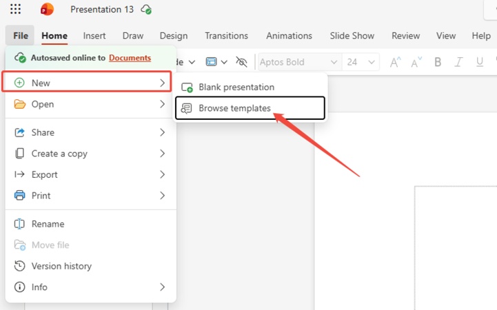
Step 1: Start with a Professional Theme
Don't start with a plain white slide. Give your presentation a cohesive look right from the start.
-
Go to File > New.
-
Click on Browse templates (or select one of the suggested themes).
-
-
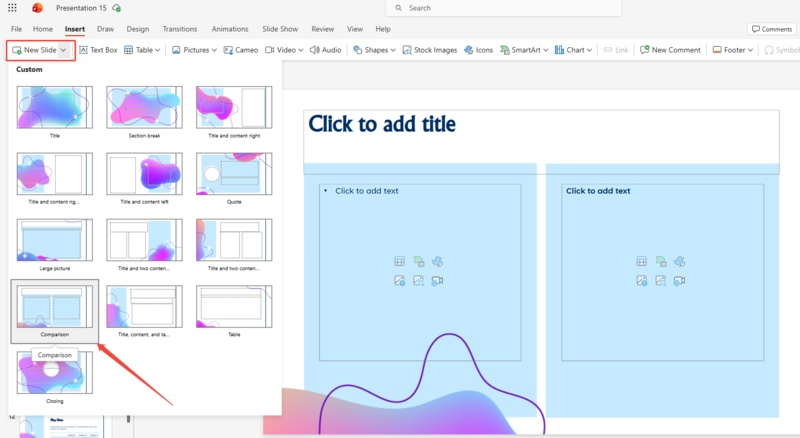
Step 2: Select the "Comparison" Layout
Once your template is open, you need a structure that naturally divides the screen.
-
Go to the Home tab.
-
Click the dropdown arrow next to New Slide.
-
Select the Comparison layout.
-
-
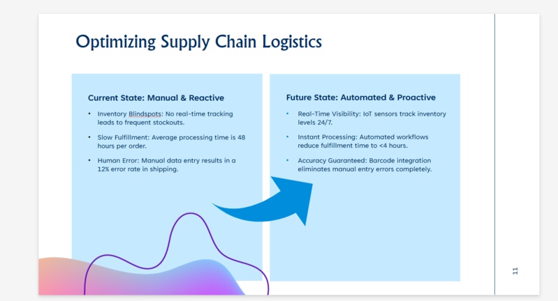
Step 3: Input Your "Current vs. Future" Content
The layout is now ready for your message. Simply click into the placeholders to populate the data.
-
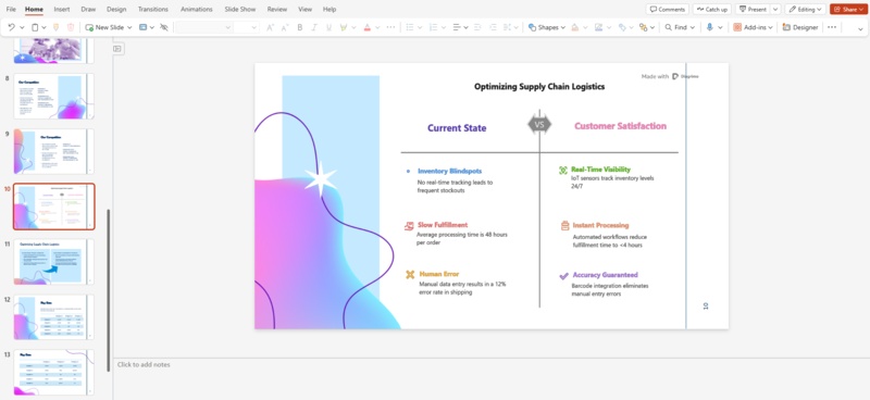
Left Side: Label this "Current State" or "The Pain." List the specific bottlenecks (e.g., "Inventory Blindspots," "Slow Fulfillment").
-
Right Side: Label this "Future State" or "The Gain." List the direct benefits that solve the problems on the left (e.g., "Real-Time Visibility," "Instant Processing").
-
-
Step 4: Enrich with Visual Icons
Text alone can be dry. To make your slideshow more engaging, add icons that fit the theme.
-
Go to Insert > Icons.
-
Select visuals that match your specific points. This simple addition makes the contrast clear at a glance and breaks up the text.
-


Diagrimo Method: Creating Visuals in Minutes with AI

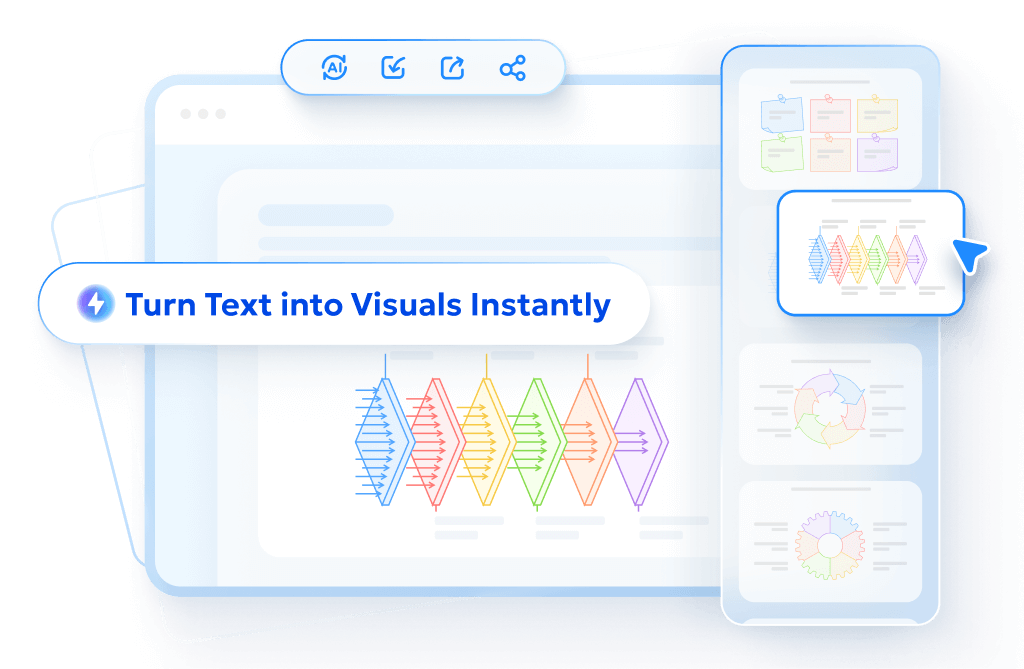
While manual layouts work, they often result in rigid, text-heavy slides. A more powerful approach is Diagrimo, an AI tool that visualizes text to create visual images instantly. We highly recommend this for presenters who want to move beyond standard problem solution slide templates without the design headache.

Diagrimo acts as your personal designer, capturing the "Problem vs. Solution" dynamic perfectly without requiring manual input for every shape and icon.
Here is how to turn your text into a graphic in seconds:
-
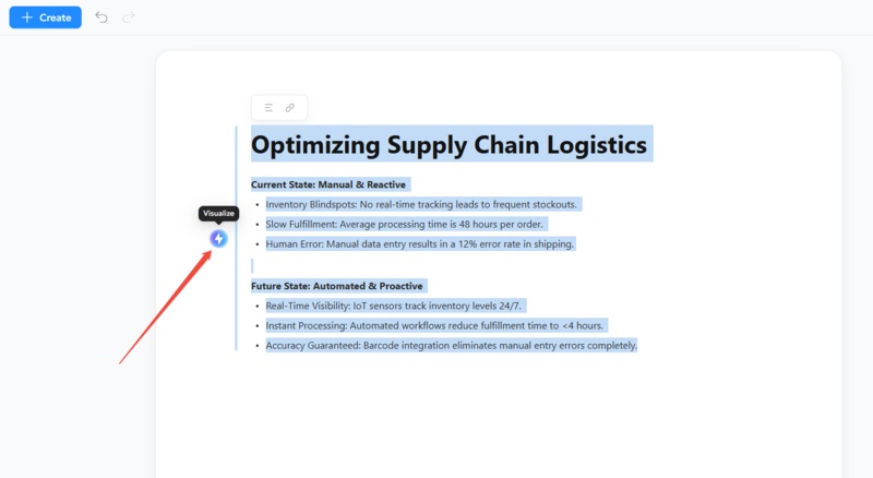
Step 1: Input Text
Open the Diagrimo canvas and type your key points naturally. You don't need to worry about formatting.
-
Step 2: Click "Visualize"
Select the text block you just typed, then click the "Visualize" icon on the left. The AI immediately analyzes the relationship between your sentences.
-
Step 3: Export and Embed
The tool automatically converts your text into a structured diagram with appropriate icons. Simply export the result and embed the problem solution images generated by Diagrimo directly into your PowerPoint problem solution slide.
Why we recommend this approach:
- Intelligent Design:
Diagrimo understands context, ensuring the visual hierarchy matches your message better than static templates.
- Workflow Velocity:
You bypass the tedious steps of alignment, resizing, and color-coding.
- Visual Impact:
You get high-end visuals that look bespoke, setting your deck apart from standard problem solution slide examples.
- Intelligent Design:


Common Pitfalls to Avoid in Problem Solution Design
Even with the best problem solution slides, presentation errors can undermine your message. Avoid these common mistakes:
- The "Wall of Text":
Never copy-paste entire paragraphs. Whether you use a manual layout or an AI tool, keep the text concise. The slide is a visual aid, not a teleprompter.
- Weak Contrast:
If your problem and solution look visually identical, the impact is lost. Ensure the solution pops visually.
- Over-Complication:
Some presenters try to cram three different problems and five solutions onto one slide. Stick to a 1:1 mapping---one major problem connected to one major solution per slide.
Final thoughts
Stop wrestling with basic PowerPoint layouts. We strongly recommend Diagrimo to elevate your pitch. This powerful tool uses AI to visualize text to create visual images instantly, transforming raw ideas into stunning diagrams in seconds. Don't just state the solution. Show it. Upgrade your workflow and capture your audience with Diagrimo today.
- AI text-to-visuals turns ideas into diagrams or infographics.
- Customizable styles match your brand and presentation tone.
- Share anytime by exporting in various formats and a link.
- No design skills needed for presentations, teaching, or reports.
FAQs
-
Where can I find a problem solution slide template free?
-
How much text should be on a problem solution slide?
-
Can Diagrimo handle technical or complex topics?
Should I animate my slide?
What is the most common design mistake?
PowerPoint includes a native "Comparison" layout. However, we recommend using Diagrimo to generate custom visuals instantly, avoiding the generic look of standard stock templates.
Limit it to 3-4 bullet points per side. If you have dense information, use Diagrimo to visualize text to create visual images that summarize the complexity into a clean diagram.
Yes. The AI is designed to parse logical relationships in text, making it excellent for converting complex technical bottlenecks into easy-to-understand visual flows.
Yes, simple reveals work best. Show the problem first, then click to reveal the solution. If using a problem solution slide free from animation (like a static image), simply use a "Fade In" effect.
Lack of visual hierarchy. If the solution doesn't visually "pop" against the problem, the emotional impact is lost. Ensure the solution side is brighter and cleaner.
