The NotebookLM infographic feature is genuinely useful, but it's also one of the most unreliable parts of the platform. If you're seeing the tab grayed out, getting a "generation failed" error, or finding the feature completely down, it usually comes down to one of a few specific causes: account type, daily generation limits, server capacity, or a staggered rollout that hasn't reached your account yet.
Read on for a breakdown of every known cause, a table of fixes ranked by effectiveness, and pro tips for getting better results when the feature actually works.
Why Is NotebookLM Infographic Not Available?
The infographic feature launched in November 2025 and triggered an almost immediate rollback. Google cited "overwhelming demand" as the reason, temporarily cutting off free users and capping Pro subscribers. As of May 2026, the NotebookLM infographic unavailable problem persists. Users on Reddit and Facebook still report the grayed-out tab with the message: "Currently unavailable, but we're working on bringing these back!" - including reports from May 20, 2026, just days before Google I/O.

Here's a breakdown of the most common causes:

How to Fix NotebookLM Infographic Not Available
If NotebookLM infographic is not working for you, these are the most consistently reported fixes from the community. No single method is guaranteed, but they work in a meaningful number of cases.
NotebookLM Infographic Best Practices & Pro Tips
Once you're comfortable with the fundamentals, these tips will help you get noticeably better results.
Tip 1: Use the "Note-as-Source" Trick
Instead of uploading a full PDF or long document, create a Note inside NotebookLM that summarizes only the key points you want visualized. Add that note as the source. This focuses the AI on your curated highlights rather than everything in the document, and the output quality improves significantly.
Tip 2: Write a Structured Custom Prompt
The default generation is basic. A community-tested approach from r/notebooklm uses a persona-driven prompt structure:
-
Define a persona: "High-utility infographic for visual learners"
-
Set principles: "Purpose-driven, accurate, information-dense without clutter"
-
Specify layout: "Clear visual hierarchy, memory-optimized structure"
-
Add element rules: "Every icon must serve a clear learning function"
-
Prohibit filler text: Explicitly tell the AI not to print the prompt's intent on the final image
Tip 3: Specify a Visual Style in Your Prompt
NotebookLM now supports 10 preset styles, but you can push further by describing the look you want directly. Here are four community-recommended styles worth trying:
Tip 4: Upload Visual Assets as Sources
You can upload a brand character, a diagram, or even a photo of a handwritten whiteboard sketch as a source. Instruct NotebookLM to "weave this asset into the infographic" to maintain visual consistency. The mobile app supports snapping photos of physical notes for exactly this purpose.
Tip 5: Use a Post-Processing Workflow for Text Errors
NotebookLM infographics frequently contain spelling mistakes, and there's no native text editor. The standard community fix:
-
Generate the infographic in NotebookLM
-
Export as PNG or PDF
-
Upload to Canva and use its "Grab Text" feature to make the AI-generated text editable
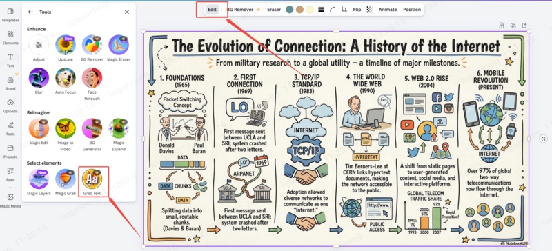
Correct errors and swap out generic icons as needed

Want Better-Looking Visuals? Try Diagrimo

If NotebookLM's infographic feature keeps letting you down, or you need something more reliable and flexible, Diagrimo is worth bookmarking.

Diagrimo is an AI-powered text-to-visual tool that turns your written ideas into clean, polished visuals in seconds. No design skills needed. Just type your content and it handles the layout, structure, and styling automatically.
Some things it works well for:
-
Turning notes, summaries, or research into shareable visuals
-
Creating visuals for presentations, social posts, or reports
-
Visualizing ideas when you're planning a project or explaining a concept
-
Making your content easier to understand at a glance
Final thoughts
The NotebookLM infographic feature is genuinely useful when it works, but the "not available" errors are a real and ongoing frustration, even for paying subscribers. The fixes in this guide (reducing sources, switching accounts, retrying off-peak) won't work every time, but they're your best options while Google continues its rollout.
If you need something that works consistently right now, Diagrimo is a solid alternative. Type in your content and get a clean visual back instantly, no server queues, no mystery limits.

- AI text-to-visuals turns ideas into diagrams or infographics.
- Customizable styles match your brand and presentation tone.
- Share anytime by exporting in various formats and a link.
- No design skills needed for presentations, teaching, or reports.
FAQs
-
Why is the NotebookLM infographic button grayed out?
-
How many infographics can I generate per day in NotebookLM?
Does NotebookLM infographic work on mobile?
-
Can I fix spelling mistakes in a NotebookLM infographic?
Is NotebookLM infographic free?
-
What's a good alternative if NotebookLM infographic isn't working?
The feature is unavailable when server capacity is constrained, when you've hit your daily limit, or when your account type isn't included in the current rollout.
Free users typically get 1 to 3 per day. Pro users have a soft cap of around 25, but this fluctuates based on global server load. Google hasn't published official numbers.
Yes, but some features may differ from the desktop version. Make sure your app is updated to the latest version to access the most recent capabilities.
Not natively. The recommended workaround is to export the infographic and edit it in Canva using its text extraction feature.
The feature is available on the free plan, but access is limited and frequently interrupted. Paid plans offer higher limits, though they're still subject to capacity blackouts.
Diagrimo lets you convert text into visuals instantly without the access issues. Free users get 100 credits per day with no unpredictable downtime.
