Just when you thought AI note-taking couldn't get any cooler than the viral 'Audio Overview' podcasts, Google dropped a visual bombshell. The platform has rapidly evolved into a multifaceted entity, and the NotebookLM infographic feature is the standout addition. In this guide, we'll show you how to create infographic in NotebookLM step by step, share the best NotebookLM infographic prompts, and help you fix common issues along the way.
What Is the NotebookLM Infographic Feature
NotebookLM Infographic feature powered by the Nano Banana Pro model built on Gemini 3 architecture, this tool uses "semantic rendering" to visualize your actual data rather than generating random art. It synthesizes information from diverse sources, including uploaded files, Google Drive, pasted text, web searches, and YouTube links to create accurate, structured graphics instantly.
Here is a quick breakdown of its pros and cons:
- Automatic generation from sources
- Source-based accuracy
- Multiple orientation options
- Adjustable detail levels
- Free to use
- Integrated with Studio features
- Multi-language support
- Quick download and sharing
- Limited design customization
- Can be text-heavy
- No real-time editing
- Requires internet connection
- May need multiple attempts
- Cannot manually adjust layouts
- Processing time for complex sources
How to Create an Infographic in NotebookLM
Before you create an infographic in NotebookLM, make sure your notebook has at least one well-structured source uploaded — the richer the source, the better the visual output. Follow this step-by-step NotebookLM infographic tutorial to generate your first visual.
-
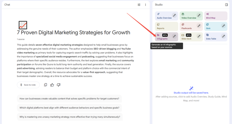
Step 1: Generate the Initial Image
Open your notebook containing your sources and locate the Studio panel on the right side of the screen. Simply click the Infographic (BETA) button, and the AI will analyze your sources to generate a default visual within 1-2 minutes.
 Pro Tip: Generate via Chat Context
NotebookLM has recently updated its workflow! You are no longer limited to using the Studio panel button. You can now directly type a prompt into the chat box (e.g., "Create an infographic summarizing the key points of our conversation"). The AI will seamlessly utilize your current chat context to generate a highly customized visual right away.
-
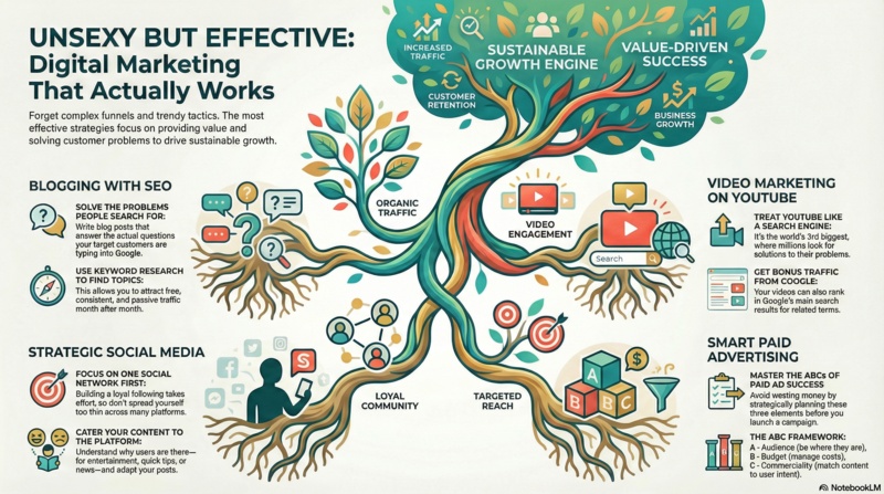
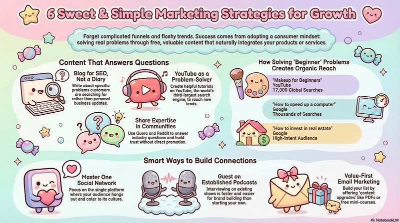
The following is an example of the infographic obtained.
-
-
Step 2: Customize the Result
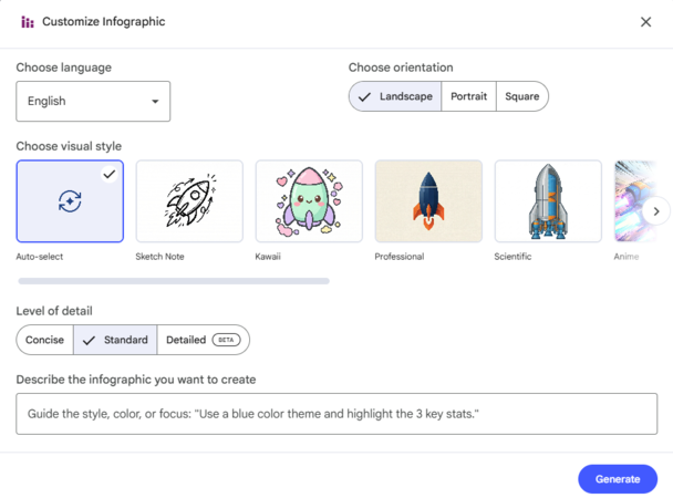
Often, the first result might be too generic or text-heavy. If you are not satisfied, you can refine it. Click the pencil icon in the upper right corner of Infographic.
-
Choose Language: You can select the specific language for the output text.
-
Select Visual Style: The platform now offers a wide variety of NotebookLM infographic styles to perfectly match your topic's tone. You can leave it on "Auto-select" to let the AI decide, or manually browse through highly stylized options like Sketch Note, Kawaii, Professional, Scientific, and Anime.
-
Select Level of Detail: Choose between Concise (less text, bigger icons), Standard, or Detailed (more comprehensive info).
-
Choose Orientation: Select Landscape, Portrait, or Square.
-
Use a Custom Prompt: In the text box labeled "Describe the infographic you want to create," below is a prompt that I've tried and found to be quite effective. You can directly copy and paste it to try.
 Related topic:
Prompt:
Related topic:
Prompt:Ensure generous empty space between all sections and elements, leaving 30-40% of the design as breathing room to boost comprehension by 20% and prevent visual overwhelm.
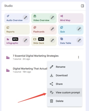
- View Custom Prompt: If you want to see the specific prompts used in the previously generated infographics, you can refer to the instructions in the image below.
 Pro Tip:
You are not limited to the default style. You can specify color codes or themes in the prompt (e.g., "Use a pastel blue and white color scheme" or "Match the style to a corporate dark mode with neon accents") to align the visual with your personal aesthetic or brand identity.
-
-
Step 3: Download and Share
Once satisfied, you can download the image to your device to include in presentations or study notes.


Diagrimo: A Lightweight Visual Tool for Organizing Ideas

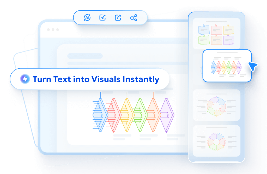
While NotebookLM is excellent for summarizing existing sources, sometimes you need a dedicated tool to actively brainstorm or map out new ideas from scratch. Diagrimo is a lightweight, web-based AI diagramming tool that bridges the gap between simple note-taking and complex design software. It allows users to instantly convert plain text into stunning visuals without the steep learning curve of professional design platforms.

Why Diagrimo Stands Out
-
Instant Text-to-Visual: Instantly transform plain text into structured diagrams like timelines and pyramids.
-
Smart AI Assistant: Use built-in AI to brainstorm and refine your content before visualizing.
-
One-Click Generation: Select any text and click "Visualize" to generate graphics in seconds.
-
Flexible Customization: Easily customize diagrams by adjusting colors, styles, and text elements.
-
Easy Export & Sharing: Download high-quality images or PDFs and share instantly via links.
-
Cloud-Based Auto-Save: Access your work from anywhere with automatic, real-time saving.
NotebookLM Infographic Daily Limit
Google hasn't published the exact numbers officially, but here's what community reports and testing confirm:
Generation Limits by Plan:
What happens when you hit the limit:
- The "Infographic" button becomes greyed out or unresponsive
- No error message is shown in most cases
- Limits reset every 24 hours automatically
What to do when you reach your NotebookLM infographic limit:
- Wait 24 hours for the quota to reset
- Upgrade to Plus or Ultra for a higher generation allowance
- Use an alternative tool like Diagrimo to keep creating visuals without interruption
Free NotebookLM Infographic Prompt Examples for Different Subjects
Below is a collection of NotebookLM infographic prompts - fill-in-the-blank templates you can adapt to any source material by simply changing the bracketed text. Think of each one as a customizable NotebookLM infographic template for any subject.
The "Timeline" Template (Best for History & Biographies)
Create a \Horizontal/Vertical\ timeline covering \Specific Time Period or Event. Highlight the \Number\ most critical turning points using a \Color\ color theme to distinguish between different eras.
The "Process Flow" Template (Best for Science & Engineering)
Illustrate the process of \Scientific Concept/Mechanism\ as a \Cycle/Flowchart. Break it down into \Number\ distinct stages, using \Style: e.g., Flat/3D\ icons to represent each step clearly.
The "Comparison" Template (Best for Economics & Literature)
Create a split-screen comparison infographic for \Topic A\ vs. \Topic B. Focus on these three criteria: \Criterion 1, 2, and 3. Use \Color 1\ for A and \Color 2\ for B to visually separate them.
The "Deep Dive" Template (Best for Complex Concepts)
Design a \Mind Map/Concept Map\ that explores the central theme of \Main Topic. Branch out into \Number\ sub-topics, using a \Vibe: e.g., Minimalist/Tech\ style to keep it organized and readable.
The "Cheat Sheet" Template (Best for Exam Prep)
Generate a 'Quick Reference' poster for \Subject/Chapter\ that lists the top \5-10\ key definitions and formulas. Use a \High Contrast/Bold\ style to make the important terms stand out for quick skimming.
The "Hierarchy" Template (Best for Sociology & Management)
Build a \Pyramid/Organizational Chart\ representing the structure of \Topic. Place the most fundamental elements at the bottom and use a \Gradient/Monochrome\ color scheme to show progression.
Final thoughts
The NotebookLM Infographic feature moves AI beyond text summaries by turning source-based information into clear visuals. Although manual editing is limited, it works as a reliable infographics tool for NotebookLM by grounding visuals in uploaded sources. Combined with tools like Diagrimo for ideation and visual thinking, it helps create an efficient visual study workflow.
- AI text-to-visuals turns ideas into diagrams or infographics.
- Customizable styles match your brand and presentation tone.
- Share anytime by exporting in various formats and a link.
- No design skills needed for presentations, teaching, or reports.
FAQs
-
Is the NotebookLM infographic free for everyone?
-
Is NotebookLM infographic down right now?
- 1.Hard refresh the page (Ctrl + Shift + R on Windows / Cmd + Shift + R on Mac)
- 2.Clear browser cache and reload NotebookLM
- 3.Switch to a different browser (Chrome is most stable for NotebookLM)
- 4.Check your daily limit — you may have reached your generation quota for the day
- 5.Verify your region — the Infographic feature is still in BETA and not available in all countries
- 6.Check Google's status page at workspace.google.com/status for any known outages
-
Why is the NotebookLM infographic not available in my account?
-
Can I edit the text inside a generated image?
-
How to fix the "NotebookLM infographic not working" error?
Yes, the NotebookLM infographic free version is available to anyone with a Google account. All Studio features are currently included without a subscription fee.
If NotebookLM infographic is down or not loading, try these steps in order:
If none of the above work, the issue is likely a temporary server-side outage. Wait 1–2 hours and try again.
If you find the NotebookLM infographic currently unavailable, it is likely because the feature is still in BETA and rolling out gradually. Ensure you are in a supported region and that your Google account is not restricted (some Workspace enterprise accounts may have beta features disabled by admins).
No, the generated infographic is a static image. If the text is incorrect, you must use the "Customize" feature to give new instructions and regenerate the visual.
If generation fails, refresh your page or clear the browser cache first. Since the feature is still in Beta, try simplifying your custom prompt to help the AI process it successfully.
