Data visualization is more than just making numbers look good; it is about making information instant and actionable. When presenting categorical data, the bar graph is often the tool of choice. However, a common dilemma arises for analysts and students alike: should you use a standard, simple bar graph, or does your data require a side-by-side (grouped) bar graph?
Choosing the wrong format can confuse your audience or obscure critical insights. This article explores the definitions, key differences, and best use cases for both graph types, helping you determine exactly which visualization suits your data.
Definitions and Common Types of Bar Graphs
To make an informed decision, one must first understand the mechanics of these visualizations. A bar graph (or bar chart) is a graphical display of data using bars of different heights or lengths. The length of each bar is proportional to the value it represents, allowing for a quick comparison of quantities across different categories.
While the fundamental concept remains the same, bar graphs come in several variations to handle different levels of data complexity:
- Simple Bar Graph: The most fundamental type, displaying a single data series. It is used to compare values of one category (e.g., Total Revenue per Year).
- Side-by-Side Bar Graph: This variation displays two or more data series side-by-side for each category. It allows for the comparison of sub-groups within a main category (e.g., Revenue per Year, broken down by Department).
- Stacked Bar Graph: Instead of placing bars next to each other, this type stacks them on top of one another. It is used to show part-to-whole relationships (e.g., Total Revenue, showing the contribution of each Department within the single bar).
- Horizontal Bar Graph: Functionally identical to vertical graphs, but the axes are flipped. These are best used when category labels are long or text-heavy.


Bar Graph vs. Side-by-Side Bar Graph: Making the Right Choice
The core difference between a simple bar graph and a side-by-side bar graph lies in the dimensionality of the comparison. When analyzing "Bar Graph vs. Side-by-Side Bar Graph," the decision usually comes down to whether you are analyzing a single variable or comparing multiple variables simultaneously.
The Simple Bar Graph: Clarity in Simplicity
A standard bar graph is best used when you need to compare items within a single data series. It is clean, uncluttered, and immediately understandable.
-
Best Use Case: Tracking changes over time for one metric or comparing totals across independent groups.
-
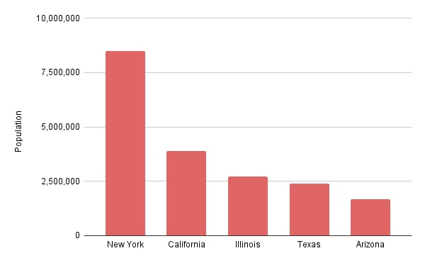
Example: Comparing the population of five different cities.
-
Limitation: It cannot show relationships between sub-groups without becoming multiple separate charts.

The Side-by-Side Bar Graph: Depth in Comparison
The side-by-side bar graph (or grouped bar chart) is designed for multivariate analysis. By placing bars relative to the same category next to each other, the viewer can compare the main category (e.g., Years) and the sub-category (e.g., Products) simultaneously.
-
Best Use Case: Comparing multiple data sets side-by-side to identify patterns, trends, or disparities between groups.
-
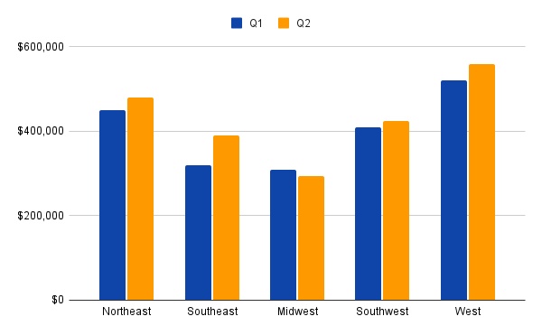
Example: Comparing Q1 and Q2 sales performance across five different regions.
- Limitation: If you have too many groups (e.g., 5+ bars per cluster), the chart becomes cluttered and difficult to read.

The Verdict
If your goal is to show the magnitude of a single item, stick to the Simple Bar Graph to avoid cognitive overload. However, if you need to highlight the relationship or contrast between two related data sets (such as "Male vs. Female" or "2023 vs. 2024"), the Side-by-Side Bar Graph is the superior choice.
Visualize Comparison Instantly: Creating Smart Graphs with Diagrimo

While bar graphs and side-by-side charts are standard tools for quantitative analysis, they can sometimes become cumbersome or overly dense, making it difficult for audiences to grasp the core message immediately. When the goal is to communicate the conclusion of a comparison rather than just the raw numbers, a different approach is often required.
Diagrimo offers a unique solution by focusing on the logic and semantics of your comparison rather than raw data plotting. Unlike traditional charting tools that require spreadsheets, Diagrimo utilizes advanced AI to understand the text and context of your notes. It identifies contrast relationships within your descriptions, such as the pros and cons of two strategies or the workflow differences between two departments, and converts them into clear, concise comparative visuals.

Why use Diagrimo for Comparative Summaries?
- From Text to Visual Logic:
If you have a written summary of a comparison, Diagrimo understands these contrast relationships and generates a visual structure that highlights the differences instantly.
- Simplify Complex Information:
For those tired of difficult-to-understand data charts, Diagrimo provides a refreshing alternative. It strips away the noise of excessive data points, offering a visual summary that focuses strictly on the key takeaways.
- Instant Structural Clarity:
Instead of spending hours tweaking design elements, you can rely on Diagrimo to automatically lay out the comparison in a way that is logical and easy to digest.
If you are looking for a way to present the results of a comparison in a format that is more engaging and accessible than a dense spreadsheet chart, Diagrimo is the ideal tool to transform your text into a professional visual summary.
Conclusion
Choosing between a standard bar graph and a side-by-side bar graph ultimately depends on the depth of the story you wish to tell. The simple bar graph remains the standard for clean, single-variable analysis, allowing viewers to quickly grasp magnitudes and trends. However, when the goal is to highlight the contrast between different groups or track multiple variables simultaneously, the side-by-side bar graph is the indispensable choice for multivariate analysis.
While data charts handle the numbers, effective communication often requires summarizing the logic behind the results. This is where tools like Diagrimo prove invaluable. By converting complex textual comparisons into structured diagrams, Diagrimo complements traditional data tools, ensuring that your audience understands not just the statistics, but the comparative insights behind them.
- AI text-to-visuals turns ideas into diagrams or infographics.
- Customizable styles match your brand and presentation tone.
- Share anytime by exporting in various formats and a link.
- No design skills needed for presentations, teaching, or reports.

FAQs
-
What are other names for a side-by-side bar graph?
-
What is the maximum number of bars recommended for a side-by-side graph?
-
What is the main difference between a side-by-side bar graph and a stacked bar graph?
-
Can Diagrimo replace Excel for creating bar graphs?
-
When is a line graph a better choice than a side-by-side bar graph?
A side-by-side bar graph is frequently referred to as a grouped bar chart or a clustered bar chart. These terms all describe the same visualization where bars are placed next to each other to represent sub-groups within a category.
To maintain readability, it is generally recommended to limit the number of bars in a cluster to three or four. Exceeding this can make the chart cluttered and hard to interpret, so consider splitting the data into multiple charts if necessary.
The difference lies in the focus: use a side-by-side bar graph to compare individual values of sub-groups directly against one another. Use a stacked bar graph when the priority is showing the total value of the category and its part-to-whole composition.
No, they serve different purposes. Excel plots exact numerical data, while Diagrimo is designed to visualize logical relationships and summaries found in text. Diagrimo is best for creating visual overviews of comparative conclusions rather than strict mathematical plots.
A line graph is preferred for tracking changes over continuous periods with many time points (like daily stock prices). Side-by-side bar graphs are better suited for discrete categories or comparing a small number of specific time intervals.
