Data visualization plays an important role in reports, dashboards, and presentations. Among many chart types, the lollipop chart stands out for its clean look and clear message. It helps people understand data quickly without extra visual noise. In this article, you will learn what a lollipop chart is, how it works, when to use it, and how to create one using different tools.
What is a Lollipop Chart?
A lollipop chart is a type of data chart that is similar to a bar chart but simpler in design. Instead of solid bars, it uses thin lines with a circle at the end. The line shows the value range, and the circle highlights the exact value.

Because of this structure, many people also call it a lollipop bar chart. It keeps the focus on the data point while reducing heavy shapes on the chart.
Types of Lollipop Chart
Lollipop charts have different types for different data needs.
-
Horizontal Lollipop Chart: Runs from left to right. Categories are on the vertical axis. Best for long labels and ranking data.
-
Vertical Lollipop Chart: Runs from bottom to top. Categories are on the horizontal axis. Works well for time series or short labels and feels familiar like a column chart.
-
Ranked Lollipop Chart: Data is sorted from high to low. Ideal for rankings such as sales leaders, ratings, or top lists.
-
Double Lollipop Chart: Shows two values per category with two dots connected by a line. Useful for before and after comparisons or planned versus actual data.
-
Lollipop Range Chart: Displays a value range instead of one point. Commonly used for showing minimum and maximum values or data variation.
Applications and Examples of Lollipop Chart
Comparing Performance: Used to compare performance across regions, products, or teams and quickly highlight top and low performers.
Survey Results: Ideal for showing average survey scores across multiple questions without clutter.
Rankings: Commonly used for top lists such as products, movies, or articles based on key metrics.
Multi Metric Tracking: Helps track multiple factors like employee satisfaction and identify strengths and gaps.
Budget Analysis: Compares planned and actual spending using double lollipop charts for clear differences.
Product Comparison: Allows easy comparison of ratings or prices across many products on e-commerce pages.
Demographic Data: Displays population, income, or education data across groups with a clean and focused layout.
Lollipop Chart vs Bar Chart
Both charts serve similar purposes, but they have key differences.

Bar charts use solid, filled bars to represent values. They're bold and familiar. Everyone knows how to read them. But when you have many categories, they can feel heavy and crowded.
Lollipop charts use thin lines and dots instead. They take up less visual space. This makes them perfect for displaying many data points without overwhelming your audience.
When to use bar charts:
-
You have fewer categories (5 to 10)
-
You want to emphasize the magnitude of values
-
Your audience expects traditional formats
-
You're showing parts of a whole
When to use lollipop charts:
-
You have many categories (10 or more)
-
You want a cleaner, modern look
-
Visual clutter is a concern
-
You're showing rankings or ordered data
Neither chart is always better. Choose based on your data and audience.
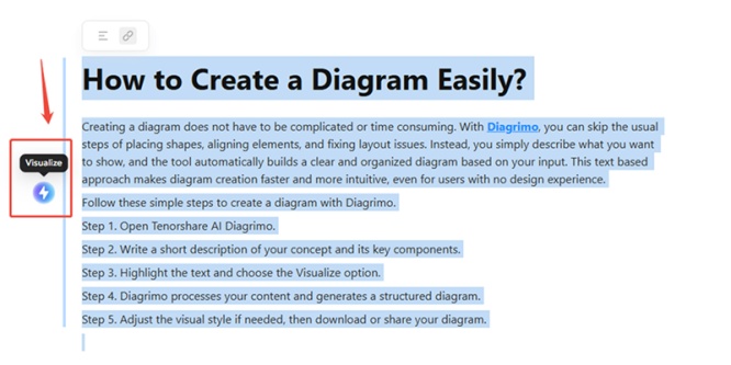
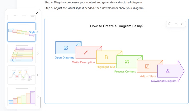
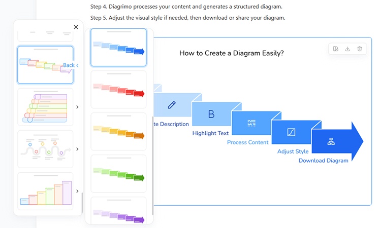
How to Create a Diagram Easily?

Creating a diagram does not have to be complicated or time consuming. With Diagrimo, you can skip the usual steps of placing shapes, aligning elements, and fixing layout issues. Instead, you simply describe what you want to show, and the tool automatically builds a clear and organized diagram based on your input. This text based approach makes diagram creation faster and more intuitive, even for users with no design experience.
Follow these simple steps to create a diagram with Diagrimo.
-
Step 1. Open Tenorshare AI Diagrimo.
-
Step 2. Write a short description of your concept and its key components.
-
Step 3. Highlight the text and choose the Visualize option.
-
Step 4. Diagrimo processes your content and generates a structured diagram.
-
Step 5. Adjust the visual style if needed, then download or share your diagram.


How to Create a Lollipop Chart Manually
Sometimes you need more control or want to create charts programmatically. Here's how to build lollipop charts from scratch.
Create a Lollipop Chart in Excel
Excel doesn't have a built-in lollipop chart option, but you can create one with a clever workaround.
-
Step 1: Prepare Your Data
Set up two columns. The first contains category names. The second contains values. Keep your data clean and organized.
-
Step 2: Create a Bar Chart
Select your data and insert a bar chart. Excel will create a standard horizontal bar chart.
-
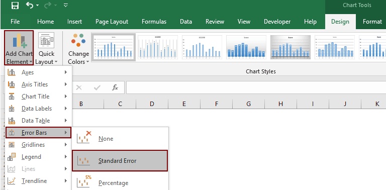
Step 3: Make Bars Thin
Click on the bars and format them. Reduce the gap width to maximum (500%). This makes the bars very thin, resembling the sticks of lollipops.

-
Step 4: Add a Scatter Plot
Right-click the chart and select "Select Data." Add a new series using your values. Change the chart type for this series to scatter plot with markers.
-
Step 5: Format the Markers
Make the scatter plot markers circular and larger. Choose a color that stands out. Position them at the end of each bar.
-
Step 6: Clean Up
Remove gridlines if desired. Adjust colors to match your presentation theme. Add a title and axis labels.
-
Step 7: Save as Template
Once you're happy with the design, save it as a chart template. This lets you quickly create similar charts with new data.
The process takes 10 to 15 minutes the first time. After that, you can reuse your template and create new lollipop charts in seconds.
Make a Lollipop Chart in Python
Python offers several libraries for creating lollipop charts. Here are the most popular approaches.
Using Matplotlib
Matplotlib is Python's most widely used plotting library. The stem plot function creates lollipop charts easily.
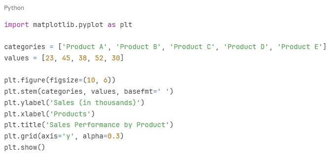
This creates a vertical lollipop chart. The basefmt parameter removes the baseline, keeping the chart clean.
Using Plotly
Plotly creates interactive charts. Users can hover over points to see exact values.
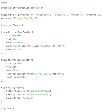
Plotly charts work great for web applications and Jupyter notebooks.
Using Seaborn
Seaborn builds on Matplotlib with better default styling.
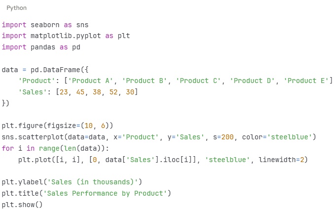
All three approaches work well. Choose Matplotlib for simplicity, Plotly for interactivity, or Seaborn for beautiful defaults.


Conclusion
Lollipop charts are a simple and effective way to compare data. They reduce visual clutter while keeping values clear and easy to read. For rankings, comparisons, and reports with many categories, they are often a better choice than bar charts.
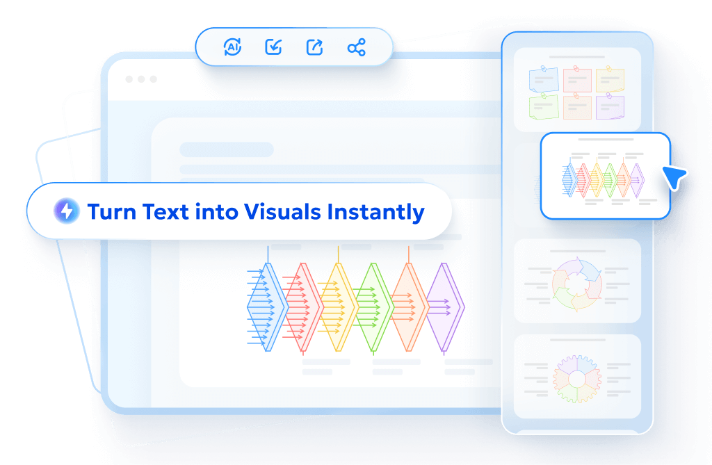
If you want an easier way to create charts and diagrams, Tenorshare AI Diagrimo is a great option. Instead of building visuals step by step, you can turn text into clear diagrams in seconds. It saves time, keeps layouts clean, and works well for data explanations, reports, and presentations. For anyone who wants fast and clear visual results, Diagrimo is worth trying.
FAQs
-
What is lollipop chart?
-
How is data represented in lollipop chart?
-
What is a lollipop chart used for?
-
Can you make a lollipop chart in Excel?
-
What is the lollipop range chart?
-
What is the ranked lollipop chart?
A lollipop chart is a variation of a bar chart. It uses thin lines with circles at the ends to show values. This makes it less cluttered than traditional bars.
Data is shown by the length of the line (like a bar) and the position of the circle (the exact value). Categories are on one axis, values on the other.
It is used for comparing categories, ranking data, or showing percentages. It works well when values are similar or when you want a cleaner look.
Yes. Use scatter plots with error bars or combo charts. Many free tutorials guide you through it.
A lollipop range chart is a variation that shows a range of values, like confidence intervals, often with lines connecting min and max points.
A ranked lollipop chart sorts categories by value, usually from highest to lowest. It is perfect for top lists or ordered comparisons.
- AI text-to-visuals turns ideas into diagrams or infographics.
- Customizable styles match your brand and presentation tone.
- Share anytime by exporting in various formats and a link.
- No design skills needed for presentations, teaching, or reports.