Infographics have always been the Achilles' heel of AI image generators. We've all been there: you ask for a "marketing flowchart," and DALL-E 3 gives you a beautiful image filled with alien gibberish text and nonsensical arrows.
But with the release of GPT Image 1.5 (December 2025), things have changed effectively. OpenAI claims this model understands spatial reasoning and text rendering significantly better than its predecessors. As someone who creates content daily, I put this new model to the test to see if it's finally ready to replace my design tools. Here is my honest review and guide.
What Is GPT Image 1.5
Released on December 16, 2025, GPT Image 1.5 is OpenAI's new flagship image generation model, now powering the "ChatGPT Images" feature. While previous models like DALL-E 3 were revolutionary for artistic creativity, they often struggled with the precision required for professional tasks like infographic design.
GPT Image 1.5 shifts the focus toward control and fidelity. According to OpenAI, the model is built for "stronger instruction following" and "detail preservation." For infographic creators, this is the missing link we've been waiting for: a model that doesn't just "imagine" a chart, but actually builds it according to your specific spatial requirements.
GPT Image 1.5 vs. Older Models for Infographics
How to Use New ChatGPT Images to Create Infographics
Method 1: Generating Directly from Prompts
If you have an idea in your head but no existing data file, use this method. The new model listens to structural instructions much better than before.
-
Step 1: Open the Image Interface
Go to the specialized ChatGPT Images tab (or simply start a chat).
-
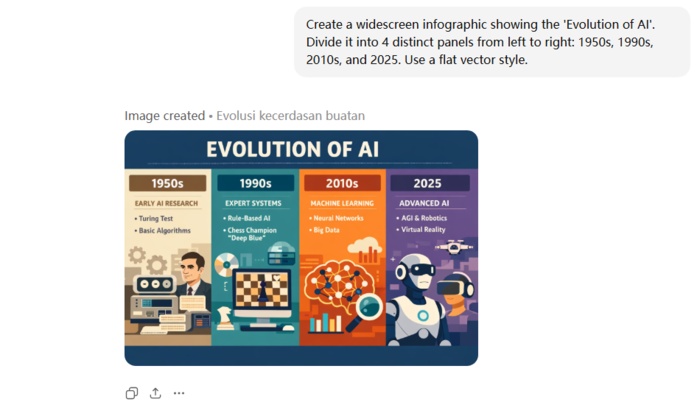
Step 2: Describe the Structure
Don't just ask for an "infographic." Be specific about the layout.
- Example: "Create a widescreen infographic showing the 'Evolution of AI'. Divide it into 4 distinct panels from left to right: 1950s, 1990s, 2010s, and 2025. Use a flat vector style."
-
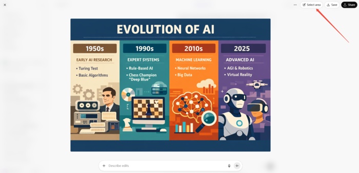
Step 3: Refine with Selection
This is the biggest game-changer. If ChatGPT misspells a word or draws an icon incorrectly, you don't need to regenerate the whole image.
- Click "Select Area" on the generated image.
-
Highlight the specific mistake (e.g., a misspelled header).
-
Type: "Change this text to read '2025 Era'." The model will fix just that spot while keeping the rest of your infographic intact.
Method 2: Generating from Documents or Reference Images
This method is perfect for converting existing content (like a blog post, a PDF report, or a rough sketch) into a polished visual.
-
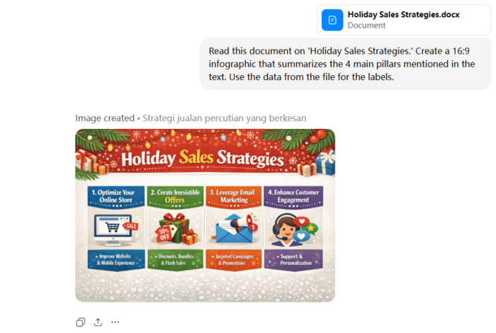
Step 1: Upload Your Source
Click the plus icon and upload your document (PDF, Word, or text file). You can also upload a screenshot of a style you like as a reference.
-
Step 2: Prompt for Interpretation
Ask ChatGPT to read the file and visualize it.
- Example: "Read this document on 'Holiday Sales Strategies.' Create a 16:9 infographic that summarizes the 4 main pillars mentioned in the text. Use the data from the file for the labels."
-
Step 3: Check Content
The model understands concepts well, but occasional spelling errors may occur. Check the text or data to ensure it's correct.
-
Step 4: Fix Immediately
If errors are found, use the editing tools to highlight the incorrect areas and tell ChatGPT the correct content. It will correct them immediately.


ChatGPT vs. Gemini: 5 Infographic Prompt Comparison Examples
I ran the exact 5 prompts through ChatGPT (GPT Image 1.5) and Google's latest Gemini image generator (Nano Banana Pro) to see who handles complex data visualization better. Here are the prompts I used and my observations.
Level 1: Minimalist & Linear (Low Visual Richness)
Create a horizontal timeline infographic showing the 'Evolution of Communication.' Steps: Smoke Signals -> Postal Service -> Telephone -> Email -> AI. Style: Minimalist line art on a white background. Accent color: Blue.
Output of GPT Image 1.5:

Output of Nano Banana Pro:

Verdict
I prefer the Gemini result for its narrative-driven design, which uses dynamic illustrations and directional arrows to visually enforce the flow of time, unlike ChatGPT's sterile, static icons. Gemini also shows greater conceptual creativity, especially in its AI depiction, resulting in a much more engaging and historically grounded infographic.
Level 2: Corporate & Structured (Medium Visual Richness)
Create a professional business infographic summarizing '2025 Remote Work Trends'. The style should be corporate and modern, suitable for a pitch deck. Use a color scheme of Navy Blue, Coral, and White. The layout must include: a large percentage visualization showing '65%', a donut chart with three segments, and a world map with connection lines between continents. Keep the design grid-based and clean.
Output of GPT Image 1.5:

Output of Nano Banana Pro:

Verdict
I prefer the Gemini result for its superior business utility which better fulfills the pitch deck objective. It elevates the design by adding plausible context like specific chart labels and city connections rather than leaving elements generic. This detail combined with the professional Key Drivers sidebar creates a more convincing corporate asset compared to ChatGPT's polished but content light visualization.
Level 3: Hand-Drawn & Organic (Medium Visual Richness)
A playful, hand-drawn infographic guide on 'How to Grow a Tomato Plant'. The style should look like a sketch made with colored markers and watercolor on textured notebook paper. Include scribbled arrows connecting the stages: 1. Seeds, 2. Sprout, 3. Flower, 4. Fruit. Use organic, wavy lines for borders and a handwritten-style font. The vibe should be messy but cute and informative.
Output of GPT Image 1.5:

Output of Nano Banana Pro:

Verdict
Both models produced excellent, distinct interpretations of the hand drawn prompt. ChatGPT created a sophisticated watercolor aesthetic with realistic botanical details resembling a professional nature journal while Gemini captured the messy but cute vibe with playful marker strokes and convincing handwritten typography. Each excelled in its specific artistic direction, ensuring the life cycle stages were visualized with high fidelity and charm.
Level 4: Isometric 3D (High Visual Richness)
A highly detailed isometric 3D infographic illustrating a 'Smart Home Ecosystem'. The image should look like a 3D clay render with soft, global lighting. Show a cross-section of a house with rooms visible. Inside, depict smart devices: a glowing thermostat, a smart speaker, and security cameras. Use floating text bubbles connected by thin lines to label the devices. Background color should be a soft pastel solid color to make the 3D elements pop.
Output of GPT Image 1.5:

Output of Nano Banana Pro:

Verdict
I prefer the Gemini result because it effectively captured the tactile clay render aesthetic better than the smoother plastic look of the ChatGPT generation. Gemini integrated the text labels as physical 3D objects within the scene rather than just flat overlays which improved the spatial depth. Additionally the lighting in the Gemini image was warmer and softer creating a more cohesive and inviting smart home diorama that aligned perfectly with the prompt's texture requirements.
Level 5: Futuristic & Data-Heavy (Maximum Visual Richness)
A futuristic, data-heavy infographic visualization of 'Global AI Network'. The aesthetic is dark mode cyberpunk. Use a background of deep black with glowing neon blue and purple data streams. The center should feature a holographic wireframe globe. Surrounding the globe are complex floating HUD elements, radar charts, and binary code waterfalls. The image should feel high-tech, glowing, and dense with information.
Output of GPT Image 1.5:

Output of Nano Banana Pro:

Verdict
I prefer the Gemini result because it generated a functional infographic with legible data rather than just an abstract illustration. While ChatGPT created a visually striking poster with gibberish text Gemini populated the HUD elements with meaningful labels like Processing Power and Neural Connectivity Index. This attention to textual detail transforms the image into a usable visualization of a network whereas the ChatGPT result serves merely as decorative sci-fi art.
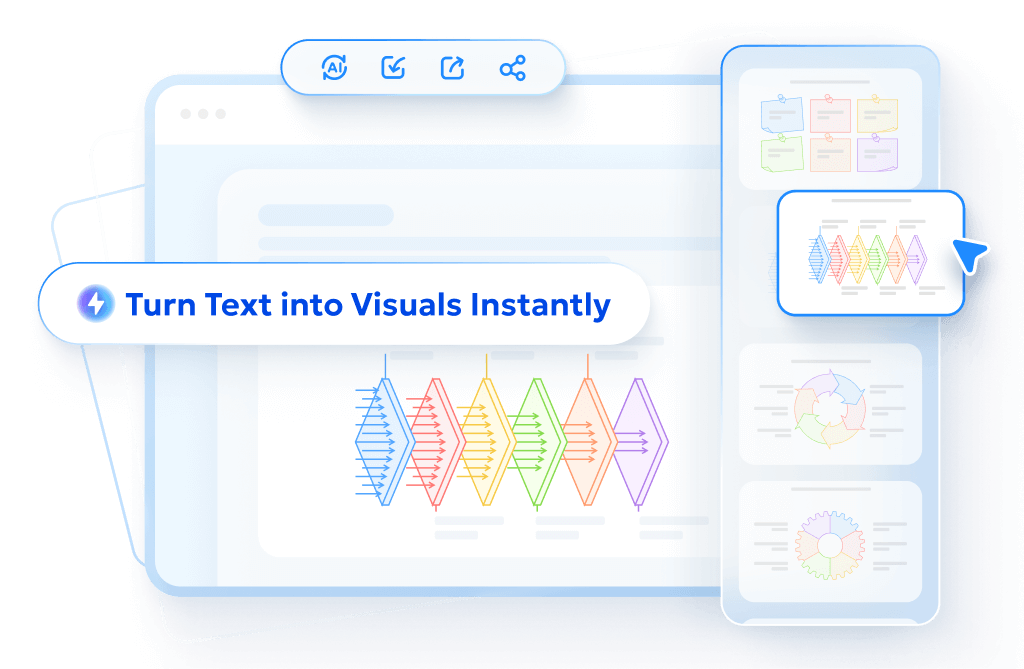
Transform Text into Eye-catching Diagrams Instantly with Diagrimo

For professionals, educators, and content creators who need to visualize complex ideas without spending hours on design, Diagrimo provides a sophisticated solution. It is designed to take the friction out of the diagramming process, allowing users to move from a rough concept to a polished, structured visual in seconds.

Diagrimo excels at converting written descriptions into organized charts. Whether you are mapping out a business strategy, outlining a lesson plan, or organizing project milestones, the tool handles the layout logic for you. This makes it an invaluable asset for anyone who needs to communicate processes clearly and professionally.
Why Diagrimo is a standout tool:
- Instant Text-to-Diagram:
Simply type your process or outline, and Diagrimo intelligently constructs the corresponding flowchart, mind map, or timeline automatically.
- Complete Editability:
You are never locked into the initial result. Every shape, text box, and arrow remains fully interactive, allowing you to tweak the layout, rewrite labels, or reorganize the flow as your project evolves.
- Professional Polish:
The tool ensures consistent alignment and styling, producing clean, presentation-ready visuals that look like they were professionally designed manually.
- Versatile Export Options:
Once your diagram is perfected, you can easily export it in high-quality formats suitable for reports, presentations, or web content, ensuring your visuals stay crisp at any size.
Final thoughts
Our testing reveals distinct strengths: Gemini Nano Banana Pro outperforms in aesthetic appeal and narrative depth, offering a "consultant-ready" polish. Meanwhile, ChatGPT excels at strict instruction following but currently lacks that visual richness. However, given OpenAI's history of rapid innovation, we expect them to close this aesthetic gap quickly.
When you need to turn complex ideas into clear visuals, Diagrimo provides an instant, text-to-diagram workflow. It handles the layout logic automatically, producing professional mind maps and charts that are fully customizable. This ensures your data is not just visually represented, but structurally sound and easy to update for any report or meeting.
- AI text-to-visuals turns ideas into diagrams or infographics.
- Customizable styles match your brand and presentation tone.
- Share anytime by exporting in various formats and a link.
- No design skills needed for presentations, teaching, or reports.
FAQs
Can ChatGPT make infographics?
-
Is GPT Image 1.5 included in the free version of ChatGPT?
-
Can I upload my own data for the AI to visualize?
-
Can I edit the layout of an AI infographic after it is generated?
Yes. With GPT Image 1.5, ChatGPT can generate complex layouts like timelines and flowcharts directly from text, offering significantly better spatial arrangement and text rendering than previous models.
It is primarily available for Plus and Enterprise users. Free users have limited daily credits for the new model.
Yes, you can upload files like PDFs or Excel sheets for visualization. However, always verify the generated numbers as AI can sometimes misinterpret complex data.
You cannot drag and drop elements, but you can refine the image via prompts. Use the selection tool to highlight areas and ask the model to adjust specific text or details.
