AI data visualization tools are revolutionizing how raw data is transformed into smart, engaging visuals. By combining artificial intelligence with intuitive design, these platforms act as an AI data visualization generator that automates chart creation, detects patterns, and delivers instant insights with no coding required. This guide explores the 10 best AI tools in 2026 to help you visualize data faster, smarter, and more effectively.
What Is AI Data Visualization Tools
AI data visualization tools are the next evolution in data analysis, merging artificial intelligence with traditional visualization. Using machine learning, natural language processing, and automated pattern recognition, these tools can quickly turn raw data into insightful visual narratives. Unlike manual charting software, AI-driven platforms automatically analyze data, suggest the best visual formats, and highlight patterns or trends that might otherwise go unnoticed.
Key characteristics of AI data visualization tools include:
-
Automated Chart Generation
AI examines data structure and content to suggest or auto-generate the most suitable chart types.
-
Natural Language Processing (NLP)
Users can type plain-language questions like "Top products last quarter," and AI instantly generates the matching chart.
-
Predictive Analytics Integration
Some tools include forecasting features, helping predict trends based on historical data.
-
Real-time Intelligence
Live data updates keep dashboards current, ideal for tracking metrics in real time.
-
Anomaly Detection
AI spots outliers or unusual patterns and flags them for review automatically.
How to Choose the Right AI Data Visualization Tool
Selecting the perfect AI data visualization tool for your needs requires careful consideration of multiple factors. The landscape includes everything from free AI data visualization tools suitable for individual users to enterprise-grade AI powered data visualization platforms designed for large organizations.
-
Ease of Use and Learning Curve
Choose tools with intuitive interfaces, drag and drop features, and quick setup. This is important for free tools used for fast experimentation without long tutorials.
-
AI Capabilities and Intelligence Level
Compare the AI features offered. Some tools provide basic automation, while others support natural language queries, predictive analytics, and generative visualizations.
-
Data Source Integration
Ensure the tool connects with various data sources like databases, APIs, spreadsheets, and cloud storage for smooth data access.
-
Scalability and Performance
Check if the tool can handle your data size and users. Free tools may suit small datasets, while enterprise tools should process large-scale data efficiently.
-
Collaboration Features
Look for support for real-time collaboration, sharing, and team workflows---important for business and group reporting.
-
Customization and Branding
Review how much control you have over styling. Some tools offer full customization and white labeling, while others have limited design options.
-
Cost Structure
Compare pricing plans, including free vs paid features, user limits, and data caps. Consider both initial and ongoing costs.
-
Mobile and Export Capabilities
Select tools that support mobile access and let you export visuals in various formats for sharing and reporting.
-
Support and Documentation
Look for strong customer support, clear documentation, and active user communities to help you get started and solve issues easily.
10 Top AI Data Visualization Tools
Here are the leading AI data visualization tools that are transforming how organizations create insights from their data:
1. Visme
Visme stands out as a comprehensive visual content creation platform that has evolved to include powerful data visualization capabilities powered by artificial intelligence. Originally known for presentation and infographic design, Visme now offers sophisticated charting and dashboard creation tools that go beyond traditional business presentations.

The platform excels at creating visually stunning charts, graphs, and interactive dashboards with professional design aesthetics. Visme's intelligent engine automatically optimizes visual presentations based on data structure and intended audience, making it particularly strong for marketing teams and content creators who need to present data in compelling formats for external audiences.
Key AI features include:
-
Automated design suggestions based on data type and audience
-
Smart color palette recommendations for optimal visual impact
-
Intelligent layout optimization for different screen sizes
-
AI-powered template matching for industry-specific needs
-
Automatic chart type recommendations
-
Smart branding integration across visualizations
Best for : Marketing teams, content creators, and organizations prioritizing visual appeal in their data presentations.
Pricing : Freemium model with paid plans starting at $29/month.
2. Canva AI Data Analysis
Canva has expanded its data visualization capabilities by integrating Flourish charts, including hierarchical treemaps and packed circle visuals. These new chart types are available to Canva's 135 million monthly users, enabling rich, interactive storytelling without any design or coding expertise.

The platform automatically processes uploaded datasets and suggests appropriate visualization formats for optimal data presentation. Users can simply upload a CSV file or connect to data sources, and Canva will provide intelligent recommendations that best represent the underlying data story while maintaining visual appeal..
Key AI features include:
-
Automatic chart suggestions based on data structure
-
AI-generated trends and summaries through Magic Insights
-
Formula generation and visuals with Magic Formulas and Charts
-
Support for advanced visual formats like treemaps and packed circles
-
Smart layout and color recommendations for different content formats
Best for: Social media managers, small business owners, educators, and users who need fast, high-quality visualizations.
Pricing: Free tier available with premium plans starting at $15 per month.
3. Tableau
Tableau democratizes data analysis and simplifies insights consumption at scale by bringing trusted generative AI to the entire platform. As one of the most established names in data visualization, Tableau continues to lead the market with its comprehensive analytical capabilities and enterprise-grade functionality.

The platform transforms how organizations interact with their data by making advanced analytics accessible to business users without requiring deep technical expertise. Tableau's intelligent engine automatically processes complex datasets and provides actionable insights that drive strategic decision-making across entire organizations.
Key AI features include:
-
Ask Data for natural language querying and instant visual answers
-
Explain Data for automatic identification of patterns and anomalies
-
Tableau Agent for generating charts, calculations, and deeper insights
-
Tableau Pulse for personalized insight summaries and proactive alerts
-
Predictive analytics and forecasting tools
-
AI-assisted data preparation and anomaly detection
Best for: Enterprise teams, analysts, and users needing scalable, AI-enhanced analytics.
Pricing: Starting at $15/month per user for Tableau Viewer.
4. Infogram
Infogram specializes in creating interactive charts, infographics, and reports with intelligent automation that simplifies the visualization process. The platform focuses on optimizing data presentation for maximum impact and engagement across different media formats.

The tool automatically analyzes data patterns and recommends visualization approaches that effectively communicate the underlying story. Infogram provides real-time optimization suggestions for improving chart readability, accessibility, and overall visual effectiveness for publication-ready content.
Key AI features include:
-
Automatic visualization type recommendations based on data patterns
-
Real-time accessibility optimization for color and contrast
-
Smart layout suggestions for maximum readability
-
AI-powered template matching for different publication styles
-
Intelligent data binding for interactive elements
-
Automated chart optimization for mobile viewing
-
Smart annotation placement for improved clarity
Best for: Journalists, marketers, educators, and content creators needing publication-quality visuals.
Pricing : Free plan available, with pro features starting at $25/month.
5. Flourish
Flourish Studio has emerged as a leading platform for creating interactive, animated data visualizations with intelligent automation capabilities. The platform specializes in storytelling through data, offering unique visualization formats that engage audiences through movement and interactivity.

Flourish excels at creating visualizations that reveal data stories over time, such as animated bar chart races and evolving network diagrams. The platform automatically handles complex data binding and creates compelling narrative flows that make data stories accessible to broad audiences.
Key AI features include:
-
Automatic data binding and column mapping
-
Smart animation timing for narrative flow
-
Intelligent transition effects between data states
-
AI-powered storytelling sequence optimization
-
Automated responsive design for different screen sizes
-
Smart template recommendations based on data structure
-
Intelligent color coding for categorical data
Best for: Data storytelling, journalism, research presentations, and public-facing data communications.
Pricing : Free tier available,contact for pricing on more advanced packages.
6. Domo
Domo represents the enterprise end of intelligent data visualization software, offering a comprehensive business intelligence platform with advanced machine learning capabilities. The platform is designed for organizations that need to integrate data visualization with broader business intelligence and operational workflows.

Unlock the power of data-driven visualization with comprehensive business intelligence tools designed for enterprise scale. Domo handles massive datasets from multiple sources while providing real-time insights and automated monitoring that keeps organizations informed of critical business changes.
Key AI features include:
-
Automated anomaly detection across all connected data sources
-
Predictive analytics and forecasting capabilities
-
Intelligent alerting system for critical metric changes
-
AI-powered data preparation and ETL automation
-
Smart dashboard recommendations based on user roles
-
Automated insight generation and executive summaries
-
Machine learning-driven performance optimization
Best for: Large enterprises, executive dashboards, and organizations requiring comprehensive business intelligence.
Pricing : Custom enterprise pricing based on users and data volume.
7. Rose AI
Rose AI positions itself as a specialized data visualization platform designed specifically for financial and business analysis. The tool focuses on providing sophisticated analytical capabilities while maintaining user-friendly interfaces for non-technical financial professionals.

The platform transforms how organizations interact with financial data by automatically processing complex datasets and presenting findings through clear, actionable visualizations. Rose AI excels at forecasting and scenario modeling, making it particularly valuable for financial planning and strategic investment analysis.
Key AI features include:
-
Automated financial trend analysis and correlation identification
-
Advanced forecasting models for financial planning
-
Intelligent scenario modeling and what-if analysis
-
AI-powered risk assessment and portfolio optimization
-
Automated report generation with executive summaries
-
Smart data cleaning specifically designed for financial datasets
-
Predictive analytics for market trend identification
Best for: Financial analysts, investment professionals, and business strategists.
Pricing : Contact for custom pricing.
8. PowerDrill AI
PowerDrill AI focuses specifically on intelligent data visualization and analysis, offering a platform designed to make advanced analytics accessible to business users without technical expertise. The tool emphasizes conversational interfaces that allow users to explore data through natural language interactions.

The platform excels at handling multi-source data integration and providing real-time analytical insights. PowerDrill automatically identifies the most relevant metrics and KPIs for different business contexts, reducing the time needed to create meaningful dashboards while continuously learning from user interactions to improve accuracy.
Key AI features include:
-
Conversational AI interface for natural language data queries
-
Automated dashboard creation based on business context
-
Intelligent drill-down suggestions for deeper analysis
-
AI-powered KPI identification and metric recommendations
-
Predictive modeling integrated into standard visualizations
-
Smart data source integration and preparation
-
Automated insight generation with actionable recommendations
Best for: Business analysts, operations teams, and organizations seeking self-service analytics.
Pricing : Subscription-based pricing with free trial available.
9. Julius AI
Julius AI empowers users to effortlessly analyze data through conversational interaction. Julius AI represents the cutting edge of conversational data visualization, allowing users to create complex analyses and visualizations through natural language conversations with advanced statistical capabilities.

The platform excels at making sophisticated statistical analysis accessible to non-technical users through intuitive conversation-based interfaces. Users can ask complex analytical questions and receive comprehensive visual analyses that include both findings and methodological explanations.
Key AI features include:
-
Advanced natural language processing for complex queries
-
Contextual understanding of analytical intent and requirements
-
Automatic statistical analysis selection and execution
-
AI-powered visualization recommendations based on query context
-
Intelligent data preparation and cleaning
-
Automated hypothesis testing and significance analysis
-
Smart interpretation of results with plain-language explanations
Best for: Researchers, analysts, and anyone needing advanced statistical analysis with minimal technical overhead.
Pricing : Freemium model with advanced features in paid tiers.
10. Qlik Sense
Qlik offers a full range of interactive visualizations and robust intelligent support including association recommendations and data preparation. Plus, Qlik features a unique "associative" data engine which lets you explore ALL of your data from any angle, directly within the visualization.

The platform stands out for its associative data model, which allows users to explore data relationships that traditional query-based tools might miss. This associative approach enables users to uncover hidden patterns and connections in their data that other analytical tools might overlook, making it exceptionally powerful for exploratory data analysis.
Key AI features include:
-
Associative AI engine for discovering hidden data relationships
-
Automated insight generation and anomaly detection
-
Smart search functionality across all data sources
-
AI-powered data preparation and modeling suggestions
-
Intelligent visualization recommendations based on data exploration patterns
-
Automated storytelling with narrative insights
-
Cognitive analytics for natural language interaction with data
Best for: Self-service analytics, exploratory data analysis, and organizations requiring flexible data exploration.
Pricing : Contact for custom enterprise pricing.
Side-by-Side Comparison Table
Key Selection Factors:
-
For beginners : Canva, Visme, Julius AI offer the lowest learning curves
-
For free options : Canva, Visme, Infogram, Flourish, Julius AI provide capable free tiers
-
For enterprises : Tableau, Domo, Qlik Sense offer advanced governance and scalability
-
For storytelling : Flourish, Infogram excel at narrative-driven visualizations
-
For AI sophistication : Julius AI, PowerDrill, Rose AI provide the most advanced AI features
Final Thoughts
AI data visualization tools are reshaping how we analyze and present information. From enterprise-grade platforms like Tableau and Domo to beginner-friendly options like Canva and Visme, there is a solution for every skill level and use case. Whether you're building real-time dashboards, forecasting trends, or crafting data stories, these tools simplify the process through automation and smart insights. Choose the one that fits your goals, team size, and technical needs and turn your data into decisions faster.
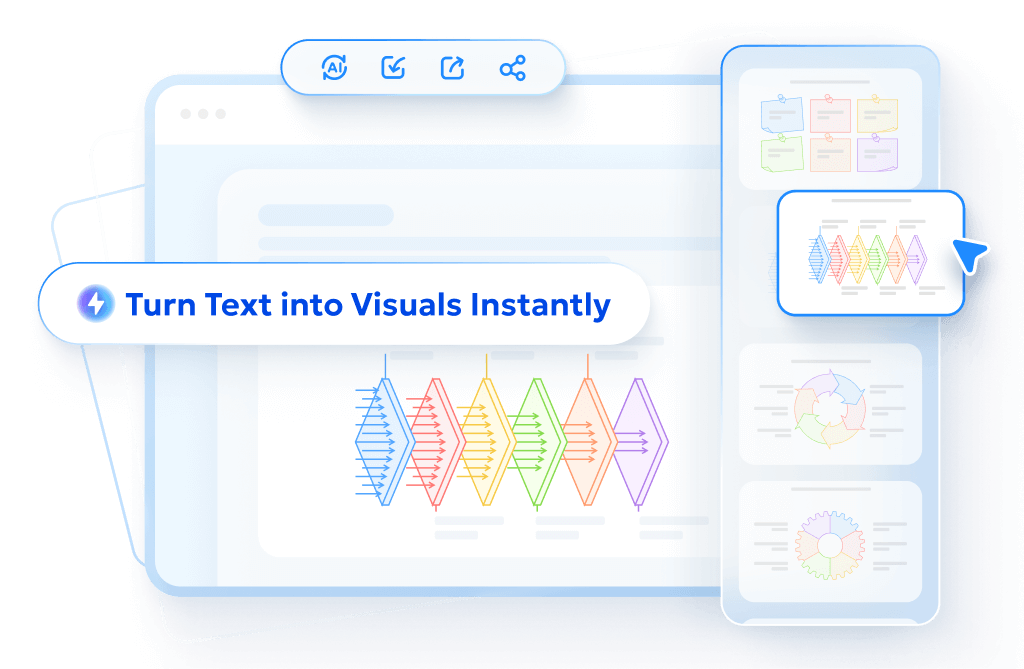
- AI text-to-visuals turns ideas into diagrams or infographics.
- Customizable styles match your brand and presentation tone.
- Share anytime by exporting in various formats and a link.
- No design skills needed for presentations, teaching, or reports.
FAQs
Are there AI data visualization free?
Yes, several tools like Canva, Visme, Infogram, Flourish, and Julius AI offer free plans with essential AI features.
Which tool is best for beginners?
Canva, Visme, and Julius AI are great options for beginners due to their simple interfaces, smart automation, and no-code setup.
Can AI tools handle real-time data updates?
Yes, platforms like Domo, Tableau, and Qlik Sense support real-time dashboards that automatically update with live data.
How is generative AI used in data visualization?
Generative AI helps create visualizations, summaries, and even full dashboards based on user prompts or uploaded data, as seen in tools like Julius AI and PowerDrill AI.
Do I need technical skills to use these tools?
No, many tools are designed for non-technical users. Features like natural language queries and smart templates allow anyone to create advanced visualizations easily.
Which tool is best for financial data analysis?
Rose AI is tailored for finance and investment scenarios, offering predictive analytics, scenario modeling, and automated financial insights.
