Climate change infographics are a great way to show important climate data, but making them can be confusing and time-consuming. Have you ever struggled to turn numbers and facts into visuals that are easy to understand? Many people get stuck because they don't know where to start or don't have design skills.
The good news is, you don't need to be a designer to create them. In this article, you'll learn how AI can help you make clear and engaging climate change infographics quickly and easily.
Let's get started.
Why Use AI for Climate Change Infographics?
Creating climate change infographics the traditional way can be tricky. You need to gather data, choose the right layout, pick colors and icons, and make sure everything looks good together. For many people, this takes hours, or even days.

AI changes all of that. With AI tools, you can turn your data into clear visuals in just a few minutes. You don't need design experience, and you don't have to start from scratch. AI helps you:
-
Save time: Generate infographic layouts instantly instead of designing every element yourself.
-
Stay accurate: Make sure your visuals match real climate data.
-
Reach any audience: Create infographics for kids, students, or professionals with just a few clicks.
Using AI means you can focus on sharing your climate message, not stressing over design.
Top AI Prompts for Generating Climate Change Infographics
AI tools are only as good as the instructions you give them. These instructions, called prompts, tell the AI what kind of infographic to create. Using the right prompts can save you a lot of time and give you professional-looking results, even if you're not a designer.
Here are some detailed examples of prompts you can use for climate change infographics:
-
Global Temperature Trends:
"Create a climate change infographic showing how global temperatures have increased over the last 50 years, using a clear line graph and simple icons for climate effects."
-
Causes of Climate Change:
"Generate a causes of climate change infographic highlighting fossil fuels, deforestation, and industrial pollution, with easy-to-understand visuals for students."
-
Effects of Climate Change:
"Make an effects of climate change infographic showing floods, droughts, wildfires, and melting glaciers, with bright, clear icons and labels."
-
Infographic for Students or Kids:
"Design a climate change infographic for students that is colorful, simple, and easy to read, using illustrations for each effect and cause."
-
Templates for Easy Use:
"Create a climate change infographic template free that can be edited for classroom projects or online presentations, with space for adding custom data."
By using prompts like these, you can quickly generate multiple versions of your infographic, experiment with layouts, and adjust the visuals to fit your audience. The best part is that AI gives you a starting point, you can always tweak colors, icons, and text to make your infographic perfect.
How to Customize Your AI Climate Infographics
AI can give you a good starting point, but customizing your climate change infographics makes them clearer and more effective. Small changes can make a big difference.
Here's how to do it:
-
Change Colors and Fonts
Use bright colors to highlight important points, like rising temperatures or extreme weather. Pick simple fonts that are easy to read.
-
Move Visual Elements
Arrange icons, charts, and graphs in a way that makes sense. For example, show the causes of climate change first, then the effects.
-
Simplify Data
Some charts may have too much information. Keep numbers and labels simple so everyone can understand quickly.
-
Add Short Captions
Add small captions to explain visuals. For example, "Glaciers are melting because of rising temperatures."
-
Think About Your Audience
-
For kids or students: Use fun icons, bright colors, and easy words.
-
For professionals: Keep it clean and focus on facts.
-
-
Keep a Consistent Style
If you're making infographics for a project or website, match the colors, fonts, and style with your brand. This makes it look professional. Customizing your AI infographic helps your audience understand the message quickly and makes your visuals look great.
Visualize Your Climate Research Effortlessly Using Diagrimo
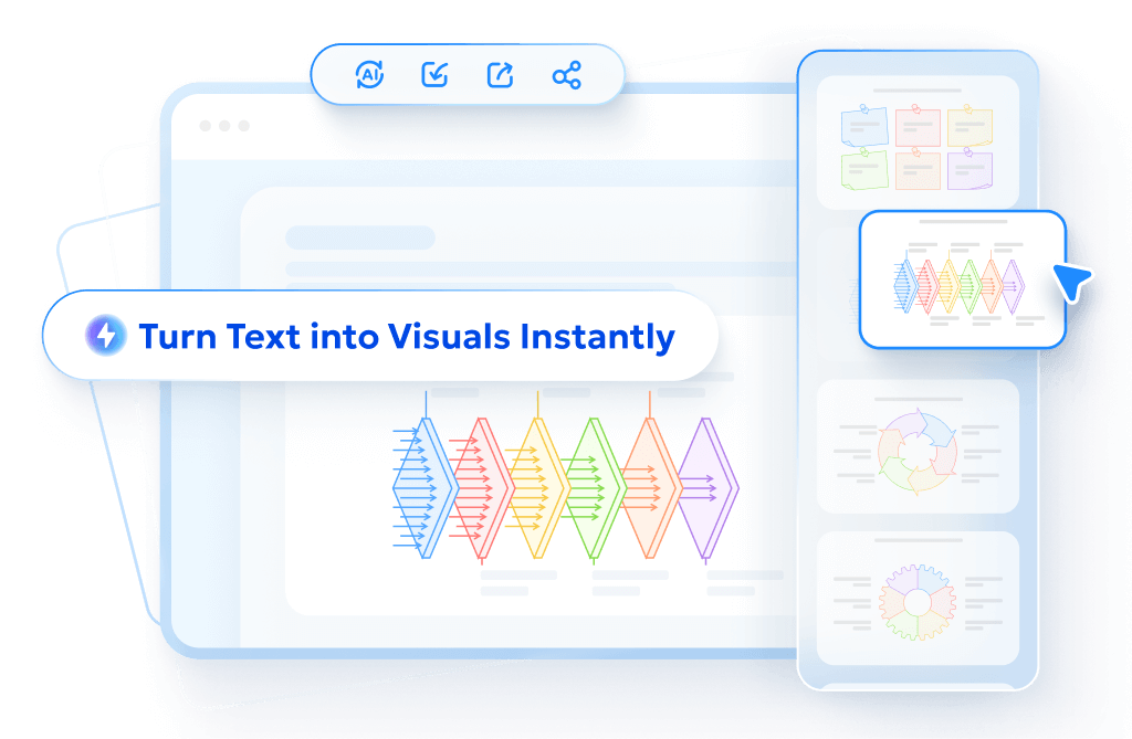
If turning your text into clear visuals feels hard, Diagrimo can make it easy, even if you have no design skills. Diagrimo is an AI tool that turns written ideas into diagrams, charts, and infographics in seconds. Its AI understands your text and suggests visuals that match your content automatically.
Here's a simple step-by-step way to use Diagrimo for your climate change infographics:
-
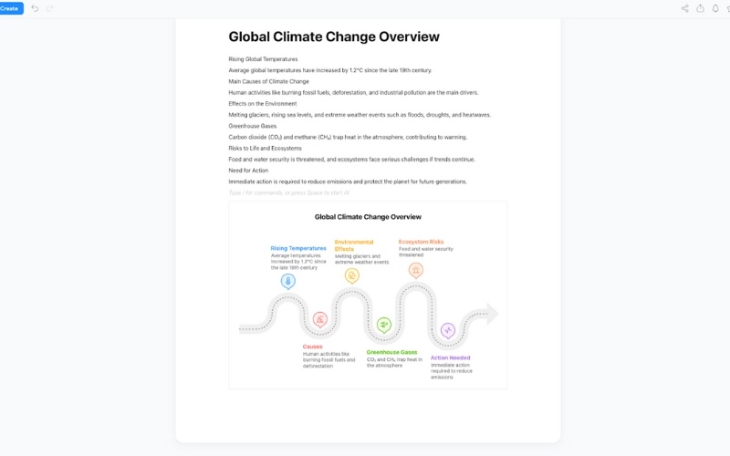
Step 1: Open Diagrimo and Paste Your Climate Research Text
Start by opening Diagrimo and pasting your notes, data, or research about climate change. You can include anything from temperature trends to causes and effects.
-
Step 2: Select and Visualize
Highlight the text you want to turn into a visual and click Visualize. Diagrimo's AI reads your content and automatically creates a diagram or infographic that organizes your ideas clearly.
-
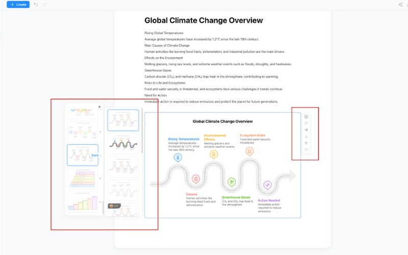
Step 3: Customize Everything According to Your Needs
Once the visual is ready, you can adjust colors, fonts, icons, layout, and style. Make it simple for students, fun for kids, or professional for reports.
-
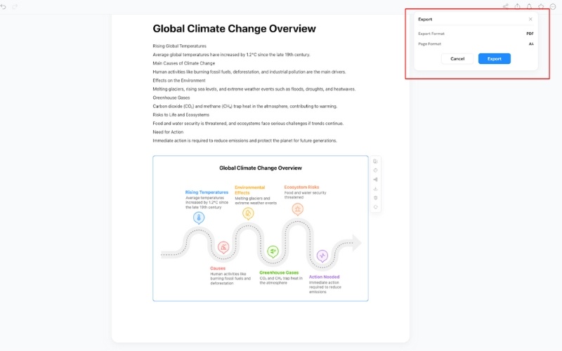
Step 4: Export and Save
When your infographic looks perfect, download it as an image or PDF. You can now share it in presentations, classroom materials, reports, or online posts.
Using Diagrimo this way saves time and makes your climate change visuals look professional while keeping the information easy to understand.


Final thoughts
Creating climate change infographics doesn't have to be hard or time-consuming. With AI tools like Diagrimo, you can turn complex climate data into clear, engaging visuals in just a few minutes. From showing the causes and effects of climate change to making educational content for students, AI helps you focus on your message instead of struggling with design.
By using the right prompts, customizing your visuals, and leveraging Diagrimo's features, anyone can make professional-quality infographics that are easy to understand and share. Start experimenting with AI today, and make your climate research come alive with visuals that truly connect with your audience.
- AI text-to-visuals turns ideas into diagrams or infographics.
- Customizable styles match your brand and presentation tone.
- Share anytime by exporting in various formats and a link.
- No design skills needed for presentations, teaching, or reports.
FAQs
What is a climate change infographic?
-
Do I need design skills to create these infographics?
-
Can I make infographics for students or kids?
-
How does Diagrimo help with climate infographics?
Can I export and share my infographics?
A climate change infographic is a visual way to show important climate information. It uses charts, icons, and graphics to explain causes, effects, or trends clearly so anyone can understand quickly.
No. You don't need any design experience. AI tools like Diagrimo help you make professional-looking infographics easily, even if you have never designed anything before.
Yes. You can create simple, colorful, and fun infographics that are easy for students or kids to understand. AI makes it simple to adjust for different ages.
Diagrimo automatically turns your text or research into visuals like charts, diagrams, and infographics. You can also customize colors, fonts, icons, and layout easily to fit your needs.
Yes. After customizing your infographic, you can download it as an image or PDF. Then you can share it in reports, presentations, social media, or classrooms.
