OpenAI dropped ChatGPT Images 2.0 on April 21, 2026, and the infographic and diagram community immediately started asking the same question: can it actually handle complex structured visuals? I ran a full chatgpt images 2.0 infographics and diagrams test across 8 prompts to find out, then put it head-to-head against Nano Banana 2 across 6 real use cases.
What Is ChatGPT Images 2.0
ChatGPT Images 2.0 supports a wide range of aspect ratios and comes in both a standard mode and a "thinking" mode with built-in reasoning. All users have access to the standard version, while thinking mode is reserved for paid subscribers.
Here's how it stacks up against its predecessor:
The thinking capabilities give it the ability to search the web, generate multiple images from a single prompt, and double-check its own creations, which allows Images 2.0 to produce marketing assets in various sizes as well as multi-paneled comic strips.
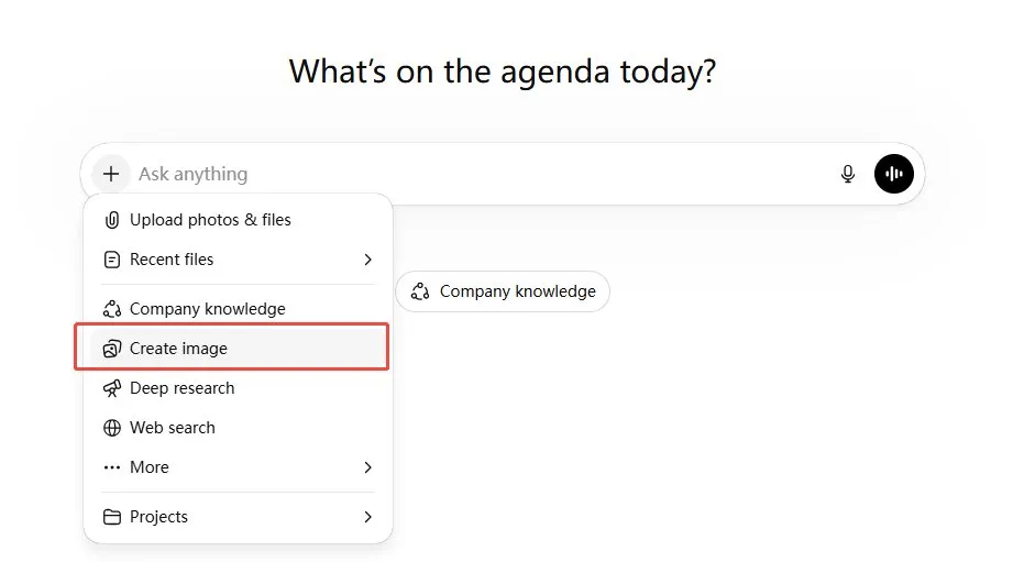
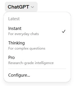
How to Use GPT-Image-2.0
-
Step 1: Click "Create Image"
Open ChatGPT and click the "+" icon next to the message bar. From the dropdown menu, select "Create image."
-
Step 2: Choose your mode.
Click the model selector at the top left. You'll see three options: Instant (standard, available to all users), Thinking (for complex multi-step image tasks, paid subscribers only), and Pro (research-grade, for the most demanding prompts).
-
Step 3: Write your prompt.
Describe what you want in plain language. The more specific you are about layout, aspect ratio, style, and text elements, the better the output.
-
Step 4: Iterate.
ChatGPT Images 2.0 supports follow-up edits in the same conversation. If a label is misplaced or a color is off, just describe the fix - the model will adjust while keeping the rest of the composition intact.


8 Infographic Prompts I Tested on ChatGPT Images 2.0
This was a proper chatgpt images 2.0 infographics and diagrams test - not cherry-picked wins. Each prompt targets a different challenge: recursive visuals, multi-panel comics, embedded UI screenshots, micro-text hidden inside photorealistic chaos. Here's what happened.
1. The "Character Sheet" Infographic
Based on everything you know about a stereotypical "Silicon Valley Startup Founder", make a character sheet functioning as an infographic. The layout must include an "inventory grid" (e.g., laptop, coffee), a daily routine timeline, and a stat radar chart. Use a clean, modern illustration style with highly legible, handwritten-style annotations detailing their traits. Make the aspect ratio 3:2
Honestly, this one surprised me. The inventory grid, radar chart, and daily timeline all land in their own zones without fighting for space. The handwritten annotations are actually legible - which, if you've tested AI image tools for any length of time, you know isn't guaranteed. Strong result for a complex multi-section layout.

2. The Manga Time-Lapse Flowchart
A "Japanese-manga-style disassembly" of a person doing a complex skateboard kickflip, laid out like a time-lapse infographic. 3:1 ultrawide aspect ratio. Tell the step-by-step physical process through visuals rather than long text. Prefer a light, clean background. Include minimal, precise English labels like "Pop", "Flick", and "Catch" under the corresponding motion frames. Make the aspect ratio 3:2
Seven frames, clean linework, labels exactly where they should be. The motion reads left to right without confusion, and the close-up foot panel row below adds real instructional value. This kind of sequential breakdown would normally take a human illustrator hours to produce.

3. The Academic Matrix Diagram
A clean, academic-style diagram explaining the "Prisoner's Dilemma" from game theory. It must feature a clear 2x2 payoff matrix in the center. Use elegant serif fonts for the main title and precise sans-serif for the matrix numbers (e.g., -5, 0, -10). Include a step-by-step logical breakdown (Step 1, Step 2) on the left side, utilizing dashed arrows to show the optimal strategy flow.
This result is genuinely mind-blowing. It perfectly understood the spatial logic of a 2x2 payoff matrix and aligned the negative integers flawlessly without any weird artifacts. The elegant typography and dashed arrows make it look exactly like a high-end university textbook page rather than an AI generation.

4. The Nested UI Screenshot
A screenshot of a computer screen in macOS. The desktop is quite messy with lots of random windows open (e.g., a terminal showing code, a music player). The front and center window is a beautifully designed, clean infographic PDF about "The History of Typography", featuring clear timelines and font examples. They're all in the background, creating depth. Make the aspect ratio 3:2
The depth effect works well: background windows feel genuinely cluttered, and the typography PDF front and center is polished and readable. Font examples in the infographic are legible. Generating a realistic UI screenshot with embedded educational content used to be impossible for these models - not anymore.

5. The Magazine Collage Mind Map
I am creating a magazine page with the theme of "Internet Culture Evolution". The title in the center of the image should be "The Meme Economy". Create a piece of art functioning as a mind map, formatted as a dense, vintage collage of retro computer UIs, pixel art, and nostalgic elements. Include small, precise text snippets scattered naturally like "Web 1.0", "Viral", and "Algorithm". Make the aspect ratio 3:2
I am absolutely stunned by the text stability in this one. Despite the dense, chaotic vintage collage aesthetic, the model correctly spelled out tiny text snippets across various retro UI windows. It successfully mapped out a logical mind map structure while perfectly nailing the nostalgic Internet vibe.

6. The Modern Indie Comic Manual
A page of a comic book in the style of a modern indie comic. It serves as an instructional infographic on "How to make a perfect pour-over coffee". It features two characters in a detailed, beautifully lit kitchen setting. The step-by-step instructions are delivered naturally through their dialogue balloons and their sequential actions across 4 distinct panels. Make the aspect ratio 3:2
Four panels, cinematic kitchen lighting, and every instruction delivered through dialogue rather than caption boxes. It reads as a real comic page while functioning as a brewing guide. Character consistency across panels is notably good - exactly what the multi-image continuity feature is built for.

7. The "Mound of Rice" Micro-Infographic
A photorealistic, zoomed-out shot of a massive, messy bulletin board covered in hundreds of overlapping sticky notes and receipts. One specific small yellow sticky note in the middle has a tiny but perfect bar chart drawn on it with the title "2026 ROI" clearly legible. This note blends into the messy board perfectly so it cannot be spotted at a glance. Make the aspect ratio 3:2
The bulletin board chaos looks genuinely photorealistic: overlapping papers, varied textures, pinned receipts. The "2026 ROI" bar chart earns a second look to find - exactly as prompted. Small but legible when you zoom in. A great stress test for embedding precise text inside photorealistic visual noise.

8. The Recursive Lecture Infographic
A gritty, photorealistic photo of a 2015 university lecture hall. A professor is pointing at a large projector screen. The slide on the screen is a clean corporate infographic about "Recursive Logic Loops". The infographic explicitly features a picture of the exact same professor pointing at the exact same infographic, and so on, recursively, forever. Make the aspect ratio 3:2
Probably the most conceptually demanding prompt in this test. The recursive nesting holds through at least two visible levels inside the projected slide, the lecture hall lighting is convincingly gritty, and the infographic text ("Self-Reference", "Iteration", "Recursion") is readable at the first projection level. Getting spatial recursion inside a photorealistic scene to work at all is a genuine achievement.

ChatGPT Images 2.0 vs. Nano Banana 2: Real Use Cases Compared
I ran the same six prompts through both models to see where each one actually wins. Here are the prompts, results, and honest evaluations.
Overall Scorecard
1. Magazine Cover
An editorial magazine cover of a high-end avant-garde fashion magazine. The subject is an Asian woman with freckles, wearing an exaggerated geometric retro suit. Shot using deadpan character photography. The main title is in a bold French font reading "L'AVENIR", and below it is an accurate Chinese subtitle "2026春季穿搭指南". The overall layout is clean, retaining real skin texture and film grain without any over-smoothing.
ChatGPT Images 2.0:
Flawless execution. The deadpan expression, hyper-realistic skin texture, and seamless integration of multiple typography styles make this look exactly like a physical, high-end fashion editorial.

Nano Banana 2:
A very strong effort with good composition and accurate Chinese text. However, the model played it a bit too "safe" with the layout, and the subject lacks that striking, raw editorial "soul."

Winner:
ChatGPT Images 2.0 . It captures the true essence of avant-garde fashion photography, whereas Nano Banana feels slightly more like a standard AI portrait with text slapped on.
2. Comic
One page of a black-and-white Seinen-style manga. It shows a motion breakdown of an intense basketball game. The page requires a layout of 4 well-arranged panel grids. One large panel is a close-up of the protagonist breaking through the defense, featuring strong speed lines. In the top right corner, a speech bubble contains the accurate Japanese text "絶対負けない!".
ChatGPT Images 2.0:
Absolutely incredible. It nailed the gritty Slam Dunk aesthetic with dynamic speed lines, perfect panel pacing, and flawlessly integrated Japanese text that actually looks hand-lettered.

Nano Banana 2:
The action is decent, but the layout feels disjointed and chaotic. The speech bubble looks digitally pasted on rather than naturally drawn into the scene.

Winner:
ChatGPT Images 2.0. It understands sequential storytelling and manga panel architecture far better.
3. The Whiteboard System Diagram
A candid photograph of a messy startup office whiteboard. Someone has drawn a highly complex "Cloud Server Architecture" diagram using smudged red and black dry-erase markers. The diagram includes drawn cylinders for databases, cloud shapes, and messy handwritten arrows with fake IP addresses. The lighting is harsh fluorescent, and the photo feels like a quick reference snap taken on a phone.
ChatGPT Images 2.0:
This generated a highly accurate, developer-grade AWS architecture diagram with perfect fake IPs and realistic marker smudging. It perfectly nailed the harsh fluorescent "quick snap" aesthetic requested in the prompt.

Nano Banana 2:
The ambient photorealism here is incredibly strong, complete with an actual office setting and a person in the background. However, the marker work is slightly less smudged, and it added unprompted nodes like Kafka and PagerDuty.

Winner:
Tie. ChatGPT Images 2.0 wins on prompt fidelity and diagram logic, while Nano Banana 2 takes the crown for ambient photorealism.
4. Simulated Analog Photography
A nostalgic and highly realistic candid nighttime flash photo. The scene is a messy college computer lab in 1999, where two friends are laughing huddled in front of a bulky vintage desktop computer. A harsh flash hits their faces, leaving deep, hard shadows on the back wall. The image quality is slightly grainy and rough, featuring realistic "red-eye" flaws and a vintage date stamp "99 11 23" in the bottom corner.
ChatGPT Images 2.0:
It flawlessly executed the harsh flash, film grain, and specific "red-eye" flaw. The vintage date stamp and authentic background posters (like the ACM sign) make it feel genuinely period-accurate.

Nano Banana 2:
The environmental storytelling here is simply breathtaking. Rich ambient details like the Compaq monitors showing AOL 4.0, Nirvana posters, and Coca-Cola cans make it look exactly like a found photograph from 1999.

Winner:
Nano Banana 2. While both are stunning, Nano Banana 2 edges ahead with its unmatched nostalgic set design and environmental storytelling.
5. TikTok Live Shopping Scenarios
A TikTok vertical live-streaming screenshot simulating a real smartphone interface. The background is a slightly dimly lit, messy warehouse full of everyday clutter. A slightly tired but earnest streamer is holding up a half-cut red dragon fruit to the front-facing phone camera. The top layer of the image must generate realistic UI overlays: including semi-transparent "Live comments" rolling on the bottom left, a yellow shopping cart icon on the bottom right, and "1.5万在线" centered at the top.
ChatGPT Images 2.0:
It generated an exact, shockingly accurate replica of the Douyin/TikTok UI layout. The Chinese typography is flawless, and the gritty warehouse background perfectly breaks the "AI plastic" aesthetic.

Nano Banana 2:
The subject and fruit look great, but the UI overlays feel like a generic, approximate mockup rather than the precise layout of the actual app.

Winner:
ChatGPT Images 2.0. The precision of its UI overlay generation and spatial awareness is simply on another level.
6. The Algorithmic Flowchart Diagram
A clean, modern flowchart diagram explaining "How a Neural Network works". Use a flat, minimalist tech style on a pure white background. It needs distinct interconnected nodes explicitly labeled "Input Layer", "Hidden Layers" (with multiple nodes inside), and "Output Layer". Use precise, non-overlapping directional arrows connecting the nodes from left to right.
ChatGPT Images 2.0:
Clean, elegant, and perfectly obedient. It strictly followed the instructions to create a classic, node-based visual with crisp text and flawless directional arrows.

Nano Banana 2:
It created a visually impressive block-style workflow diagram packed with detailed text. However, it completely ignored the specific prompt instructions regarding the interconnected circular nodes.

Winner:
ChatGPT Images 2.0. While Nano Banana's result is beautiful, ChatGPT wins for absolute prompt adherence and structural accuracy.
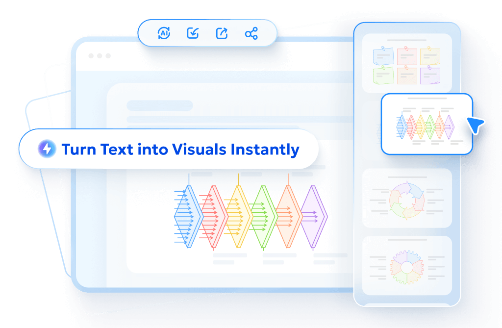
Want Cleaner Visuals? Try Diagrimo

If testing these prompts has you thinking about how to actually use AI-generated visuals in your work, Diagrimo is worth knowing about. It's a text-to-visual tool that turns plain language descriptions into polished, ready-to-share visuals - no design background needed.

Where ChatGPT Images 2.0 excels at generating one-off creative images, Diagrimo is built for visual communication that needs to be clear, editable, and reusable. Think of it as the practical complement to AI image generation: once you have a concept, Diagrimo helps you turn it into something you can actually present, publish, or hand off.
Here's where Diagrimo fits naturally into a content creator's workflow:
-
Turning content outlines into visual summaries for blog posts or newsletters
-
Building presentation slides with clean, text-driven visuals
-
Creating comparison tables and process overviews without touching design software
-
Explaining complex ideas visually for social media or educational content
-
Producing shareable visual assets from plain-text briefs
Final thoughts
ChatGPT Images 2.0 marks a clear improvement in handling structured, text-heavy visuals. It delivers more consistent results for complex infographic prompts thanks to stronger reasoning and prompt adherence.
Still, the best tool depends on your goal. Nano Banana 2 performs well for photorealistic scenes, while ChatGPT Images 2.0 is better for clear, text-focused visuals. And when you need something polished, editable, and ready to share without the trial-and-error, Diagrimo is the cleaner path.
- AI text-to-visuals turns ideas into diagrams or infographics.
- Customizable styles match your brand and presentation tone.
- Share anytime by exporting in various formats and a link.
- No design skills needed for presentations, teaching, or reports.
FAQs
-
Is ChatGPT Images 2.0 good for infographics?
-
How does ChatGPT Images 2.0 compare to Nano Banana 2?
-
Does ChatGPT Images 2.0 support non-English text?
-
Can I generate multiple images from one prompt?
Yes. Based on this ChatGPT images 2.0 infographics and diagrams test, it handles dense text layouts, multi-panel compositions, and complex diagrams significantly better than previous versions.
GPT Image 2 wins on structural control and text rendering, while Nano Banana 2 wins on photorealism and generation speed. For infographic work specifically, Images 2.0 has the edge on prompt fidelity.
Yes. OpenAI says the model has a stronger understanding of non-Latin text rendering in languages like Japanese, Korean, Hindi, and Bengali.
Yes, up to eight distinct images from a single prompt, with character and object continuity maintained across the series.
