Graphs help people understand data quickly. Students, teachers, and professionals use graphs to compare values, spot patterns, and explain results. Two common graphs are Histograms and Bar Graphs. Many people confuse them because they look similar at first glance. This confusion often leads to wrong data interpretation.
In this guide, I clearly explain Histogram vs Bar Graph , how each graph works, and where to use them. You will learn definitions, real examples, key differences, and clear rules for choosing the right graph. By the end, you will understand Bar Graph vs Histogram without any confusion and create correct charts with confidence.
What Is a Bar Graph?
A Bar Graph shows data using rectangular bars. Each bar represents a category. The height or length of the bar shows the value of that category. Bar Graphs work best for comparing different groups or items.

Structure of a Bar Graph
A Bar Graph uses categorical data. Categories appear on the horizontal axis, while values appear on the vertical axis. Each bar has a gap between it and the next bar. These gaps show that each category stands alone. This structure clearly separates one category from another, which explains why Bar Graph vs Histogram looks similar but works differently.
Real-Life Examples of Bar Graphs
People use Bar Graphs in many daily cases:
-
A teacher compares test scores of different classes.
-
A shop owner compares monthly sales of products.
-
A survey shows how many people prefer tea, coffee, or juice.
In each case, the data falls into categories. This makes a Bar Graph the right choice. When students practice with a Histogram vs Bar Graph worksheet, they often spot gaps first to identify a Bar Graph.
Bar Graph vs Histogram in Learning
Teachers often explain Bar Graph vs Histogram using simple classroom examples. A Bar Graph always focuses on named groups, not number ranges. This key idea helps avoid mistakes in exams and assignments.
What Is a Histogram?
A Histogram also uses bars, but it shows a very different type of data. A Histogram displays numerical data that falls within ranges. Each bar shows how often values appear in a given range.

Structure of a Histogram
A Histogram uses continuous data. The horizontal axis shows number ranges, also called bins. The vertical axis shows frequency. Unlike a Bar Graph, a Histogram has no gaps between bars. The bars touch each other because the data flows continuously. This is the clearest visual sign when comparing Histograms vs Bar Graphs.
Examples of Histogram Usage
Histograms appear often in statistics:
-
Test score ranges (0--10, 11--20, 21--30)
-
Age ranges in a population
-
Height or weight distribution
A statistics student often uses a Histogram maker to study how data spreads across ranges. These examples show why Histogram vs Bar Graph matters so much in data study.
Histograms vs Bar Graphs in Practice
When people mix up Histograms and Bar Graphs, they often label data wrongly. Knowing that Histograms deal with number ranges prevents this mistake and helps you choose the right chart every time.
Key Differences Between Histogram and Bar Graph

Understanding the difference between Histogram vs Bar Graph becomes easy when you compare them side by side.
When to Use Histogram vs Bar Graph
Choosing the right graph saves time and avoids wrong results. Many learners ask when to use Histogram vs Bar Graph, so let's simplify it.

A Histogram Works Best When:
-
Data is continuous
-
You want to show frequency distribution
-
Values fall into ranges
Examples include test scores and age groups. This explains Histogram vs Bar Graph when to use in statistics.
A Bar Graph Works Best When:
-
Data is categorical
-
You want to compare groups
-
Each value stands alone
This rule helps in business, education, and surveys. Knowing Bar Graph vs Histogram improves report quality.
Comparing with Other Graphs
People also compare Histogram vs Bar Graph vs line graph when tracking trends. Line graphs show change over time, not categories or ranges. A Histogram vs Bar Graph vs pie chart comparison shows that pie charts focus on parts of a whole. In math lessons, teachers explain Histogram vs Bar Graph vs dot plot to show how dots represent individual values. Advanced students compare Histogram vs Bar Graph vs frequency polygon and Histogram vs Bar Graph vs polygon to study data shapes.
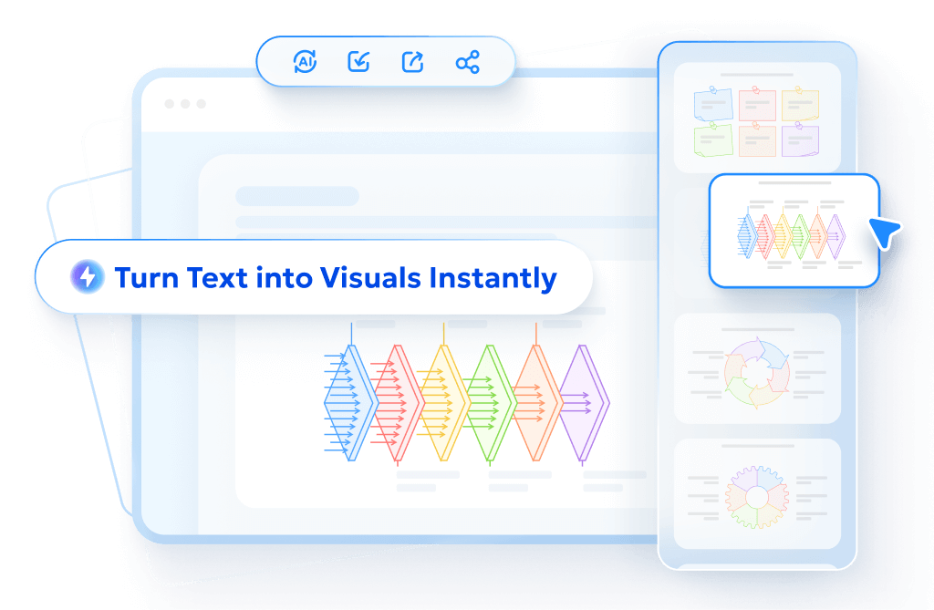
Creating Professional Graphs with Tenorshare AI Diagrimo

Creating clear charts should not feel hard. Tenorshare AI Diagrimo helps users design charts easily, even without design skills. Tenorshare AI Diagrimo is an AI-based diagram tool. It helps users create Bar Graphs and Histograms in minutes. Students, teachers, and professionals use it to save time and avoid errors.

Key Features
These features support correct Histogram vs Bar Graph creation without confusion.
Benefits for Users
Tenorshare AI Diagrimo reduces manual work. It helps users focus on data meaning instead of formatting. Whether you need a Histogram maker or a simple Bar Graph, this tool keeps charts clear and readable.
Conclusion
Understanding Histogram vs Bar Graph improves how you read and present data. Bar Graphs work best for categorical data. Histograms work best for numerical frequency data. Knowing this core rule removes confusion and improves accuracy. Choosing the right graph helps students score better and professionals explain results clearly.
Tools like Tenorshare AI Diagrimo make chart creation simple and correct. If you want clear, accurate charts without stress, visit Tenorshare AI Diagrimo and start creating graphs quickly and efficiently today.
FAQs
-
Can a Bar Graph and Histogram show the same data?
-
What is the main visual difference between Histogram vs Bar Graph?
-
Can I create both using free tools?
-
When should I use a Histogram over a Bar Graph?
-
How does Tenorshare AI Diagrimo simplify chart creation?
No. A Bar Graph uses categories, while a Histogram uses number ranges. This key rule defines the difference between Histogram vs Bar Graph.
Bar Graphs have gaps. Histograms have no gaps. This simple sign helps identify Histogram vs Bar Graph difference quickly.
Yes. Many tools exist, but Tenorshare AI Diagrimo offers an easy and guided way to build both graphs correctly.
Use a Histogram when data is continuous and grouped into ranges. This rule answers when to use Histogram vs Bar Graph clearly.
It automates layout, labeling, and spacing, helping users avoid mistakes common in Histograms vs Bar Graphs.
- AI text-to-visuals turns ideas into diagrams or infographics.
- Customizable styles match your brand and presentation tone.
- Share anytime by exporting in various formats and a link.
- No design skills needed for presentations, teaching, or reports.