Have you ever looked at a standard bar chart and felt a bit bored? We see rectangles and grids every day, and sometimes they fail to capture the imagination. Data visualization is not just about numbers. It is about telling a story that people can feel and understand instantly. This is where the Polar chart shines. It takes your data and spins it into a circle, turning dry statistics into something that looks like a flower or a compass.
Today we are going to explore how you can use this polar chart to tell your own data stories.
The Heroic History of the Polar Chart
This chart has a heroic history. Florence Nightingale, the famous nurse, used a variation of this chart called the "Rose Diagram":

Source: Wikimedia
Interpretations of the Chart:
- Blue/Gray Wedges (Largest Area): Represent the number of soldiers who died from preventable diseases (such as cholera, typhus, and other infections).
- Red/Pink Wedges: Represent the number of soldiers who died from battlefield wounds.
- Black Wedges: Represent deaths from other causes.
Through this chart, Florence Nightingale powerfully demonstrated that "soldiers dying from diseases caused by poor sanitation far outnumbered those dying in battle." This striking data visualization shocked the British establishment at the time, eventually driving major reforms in military sanitation and healthcare, which saved countless lives.
Diagrimo makes it simple to create impactful data visualizations like this.
What is a Polar Chart?
To understand this chart, you have to think differently about space. Most charts use a grid like a city map with X and Y axes. A polar chart is different. It works more like a radar screen.
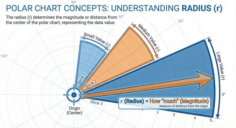
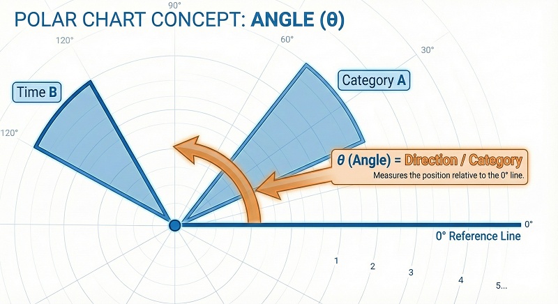
There are two main ingredients in Polar chart math:
-
Radius: This is the distance from the center point to the edge. It
represents how "much" of something you have. A longer slice means a bigger
number.
-
Angle: This is the direction around the circle. It usually
represents a category, a time of day, or a direction.


If you are a student or analyst, you might look for a Polar chart calculator to convert your data. The math is simple geometry. You transform a standard grid coordinate into a circular one using sine and cosine functions.
The Big Comparison: Polar vs. Radar vs. Pie
This is where many people get confused. These three charts are all circles, but they speak completely different languages.
Polar Chart vs Radar Chart
This is the most common mix up. When searching for Polar chart vs radar chart, remember this simple rule. A Radar chart (or Spider chart) uses points connected by lines. It looks like a spider web. It is perfect for comparing multiple variables at once, like a video game character having attributes for speed, strength, and defense.
Radar chart:

A Polar chart is different. It usually uses filled bars or area slices. It is better for continuous data or comparing magnitudes, like the amount of rainfall in different months.
Polar Chart:

Polar Chart vs. Pie Chart
A Pie chart is all about percentages. The slices must add up to 100%. If you change the angle of the slice, you change the value.
Pie chart:

In a Polar chart, the angles are usually equal slices of the pie, like the 12 hours on a clock. The information is in how far out the slice extends from the center, not how wide the slice is.
Polor chart:

Why Should You Use Polar Chart?
The Polar chart is not just pretty. It solves specific problems that linear charts cannot.
Best Use Cases of Polar Chart
When should you choose this over a standard bar chart? Here are the top scenarios.
-
Time and Cycles
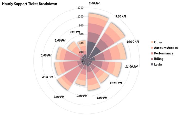
A polar chart is ideal for cyclical data such as 24-hour traffic flow, website visits, or temperature changes. Unlike a bar chart, it connects the start and end of the cycle, making daily patterns such as morning and evening peaks easy to see.
-
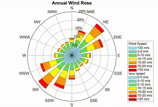
Directional Data
This is common in meteorology. A Wind Rose is a type of polar chart that shows which direction the wind blows most often.
-
Science and Education


There is a niche known as polar chart chemistry, where radar charts (also called spider charts or polar charts) are used in chemical data visualization.
For example, these charts can compare multiple physicochemical properties of compounds, such as solubility, LogP, molecular weight, and the number of hydrogen bond donors and acceptors.

The Advantages:
- Cyclical Data: It is perfect for things that repeat. Think about the 24 hours in a day, the 7 days in a week, or the seasons. A linear chart has a beginning and an end, but a circle connects the end back to the start.
- Space Saving: A long bar chart might run off the side of your page. A polar chart wraps that data into a neat, compact circle.
- Engagement: It grabs attention. In a report full of boring tables, a polar chart stands out immediately.
The Disadvantages:
The Area Illusion: The outer rings of the circle have a larger circumference than the inner rings. This means a value of "10" on the outside looks physically bigger than a value of "10" near the center. This distortion can sometimes trick the eye.

How to Create a Polar Chart?
You want to make one, but how? It depends on your technical skills.
1. Use Polar Chart Maker Automatically
If you do not want to struggle with Excel settings, use a dedicated polar chart maker. Popular polar chart maker includes Canva, Flourish, or Vizzlo. They allow you to paste your data and generate a beautiful chart instantly. These are great for presentations.
Try Diagrimo to quickly convert text data into charts and visualize your ideas with just one click.
2. Make Polar Chart in Excel Manually
Building a polar chart manually in Excel is not very intuitive and often involves several tedious setup and adjustment steps. In this example, we use the monthly service level data of ABC Inc and XYZ Inc to show how to prepare data for a polar chart in Excel.
Step 1: Set Up Angle and Radius Data
-
In column B (B4:B15), keep the month names, which will be used later as chart labels.
-
In column G, calculate the angle (θ) for each month.
-
Enter 0 in G3 as the starting angle.
-
Use the formulas G4 = 360/12 and G5 = G4 + 360/12, then fill down.
-
-
In columns H and I, calculate the radius values for ABC Inc and XYZ Inc by scaling the original data.
-
Use H4 = C4/10 and I4 = D4/10, then copy the formulas downward.
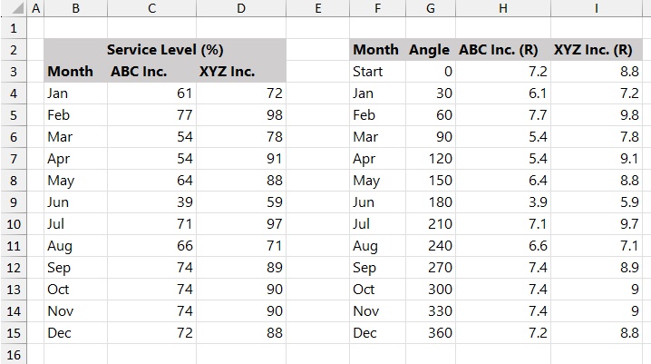

After this step, the angle and radius values required for the polar chart are ready.
Step 2: Calculate X and Y Values
Since Excel does not support polar coordinates directly, the angle and radius values need to be converted into standard X and Y coordinates before plotting.

-
Use the sine function to calculate the X-axis values for both data series.
-
K3 = H3SIN(G3/180PI())
-
M3 = I3SIN(G3/180PI())
-
-
Use the cosine function to calculate the Y-axis values.
-
L3 = H3COS(G3/180PI())
-
N3 = I3COS(G3/180PI())
-
-
Copy all formulas down to apply the calculations to every month.
After completing this step, the data table contains the X and Y coordinates needed to plot the polar chart using a scatter chart.
Step 3: Prepare the Polar Chart Grid
This step prepares the grid data that will be used to build the polar chart layout with doughnut charts. Looks like this:

Step 4: Insert a Doughnut Chart
Select the range Q3:AB14, go to the Insert tab, and insert a Doughnut Chart.

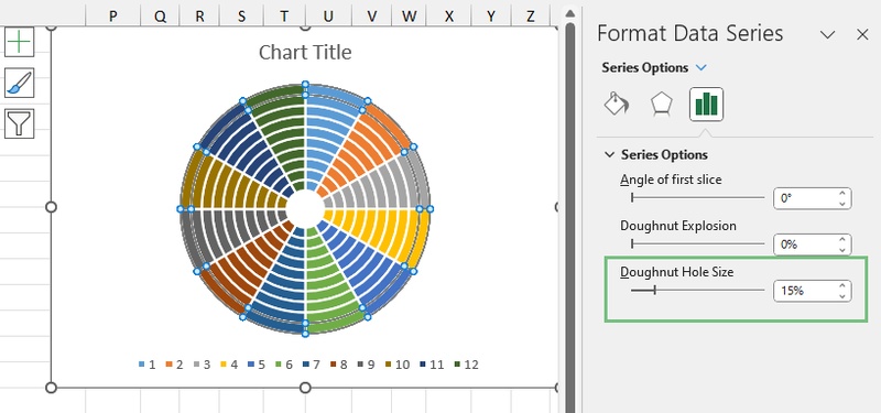
Step 5: Change the Doughnut Hole Size
To make the grid rings thinner and more accurate, adjust the size of the doughnut hole.
-
Right-click on any ring in the chart.
-
Click Format Data Series from the context menu.
-
Set the Doughnut Hole Size to 15%.

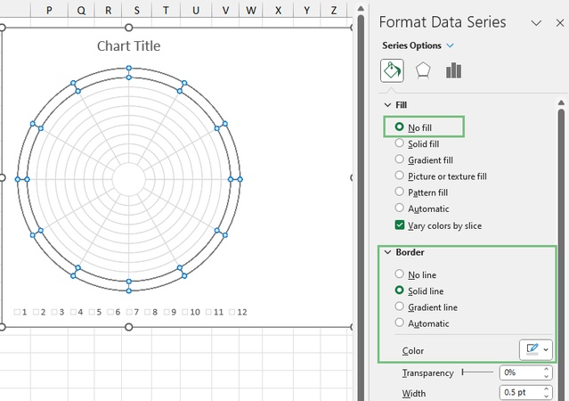
Step 6: Adjust the Grid Style
After inserting the doughnut chart, adjust the grid style so it does not distract from the data.
-
Select the outer ring of the doughnut chart, then apply the same settings to all rings.
-
Open the Fill & Line options in the Format pane.
-
Set Fill to No fill.
-
Under Border, choose Solid line, select a light gray color with slight transparency, and set the line width to 0.5 pt.

Step 7: Add Data Series to Polar Chart
With the grid ready, you can now plot the performance data for ABC Inc and XYZ Inc.
-
Select the range K2:L15, then click Copy.
-
Open the Paste dropdown and choose Paste Special.
-
In the dialog box, select New series, choose Columns for Values (Y) in, and make sure Series Names in First Row and Categories (X Labels) in First Column are checked.
-
Click OK to add the data series.


Repeat the same steps to add the XYZ Inc data series to the chart.
Step 8: Change the Polar Chart Type
After adding the data series, convert them from doughnut charts to scatter plots.
-
Right-click on one of the data series in the chart.
-
Select Change Series Chart Type.
-
In the Combo chart settings, set both ABC Inc and XYZ Inc to Scatter with Smooth Lines and Markers.
-
Keep the Secondary Axis option enabled by default.
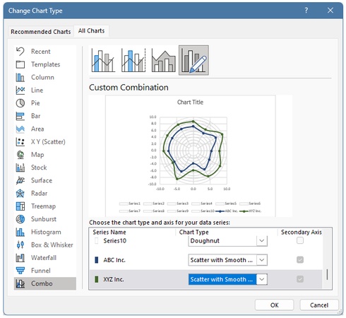

This overlays the data lines onto the polar grid.
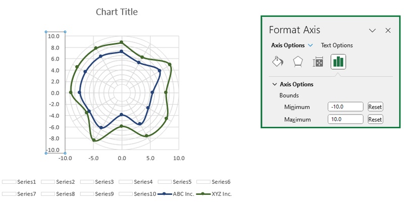
Step 9: Set the Axis Scale
To center the polar chart and keep it symmetrical, adjust the axis ranges.
-
Right-click the horizontal or vertical axis and choose Format Axis.
-
Set the Minimum Bound to -10 and the Maximum Bound to 10.
-
Apply the same settings to both axes.

Step 10: Add and Format Labels
In the final step, clean up the chart and display the month labels around the circle.
-
Remove both the X-axis and Y-axis from the chart.
-
Right-click the outer ring and select Add Data Labels.
-
Right-click a label and choose Format Data Labels.
-
Check Value From Cells, then select the range B4:B15.
-
Click OK, uncheck Show Leader Lines, and adjust label positions as needed.
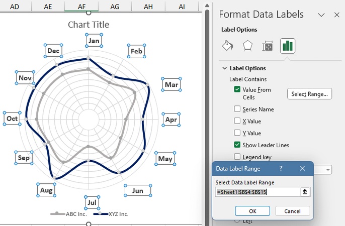

The polar chart is now complete!
Make Infographic Image with Diagrimo Instantly

Creating charts and visuals does not have to be complicated. Diagrimo is designed for people who want to turn ideas into clear visuals without spending time on tools or layouts. Instead of adjusting charts manually or dealing with complex settings, you simply describe what you want in text, and Diagrimo helps transform that information into a clean infographic or chart.

Conclusion
The Polar chart is a beautiful blend of science and art. It breaks the monotony of rows and columns and offers a fantastic way to visualize cycles, directions, and scientific trends. Next time you have data that repeats over time or relates to direction, do not just reach for the standard bar graph. Try spinning your data around. You might find that a Polar chart gives your audience the fresh perspective they need.
For those looking to experiment with visual storytelling, our AI inforgraphic maker offer a simple starting point.
- AI text-to-visuals turns ideas into diagrams or infographics.
- Customizable styles match your brand and presentation tone.
- Share anytime by exporting in various formats and a link.
- No design skills needed for presentations, teaching, or reports.