Have you ever needed a clear way to compare categories while also showing subcategories within each group? This is where a segmented bar graph comes in handy. Unlike simple bar charts, segmented bar graphs divide each bar into segments that represent parts of a whole, helping you visualize relationships between categories and subcategories at a glance.
In this article, we'll explain what a segmented bar graph is, how it differs from a mosaic plot, provide step-by-step instructions to create one using tools like Diagrimo, and show practical examples to help you read and interpret this type of chart effectively.
Let's get started.
What is a Segmented Bar Graph?
A segmented bar graph (also called a segment bar graph) is a type of bar chart in which each bar is divided into multiple segments. Each segment represents a subcategory within the main category, and the size of the segment corresponds to its proportion of the total.
The main purpose of using a segmented bar graph is to compare both overall values and individual subcategory contributions in one visual. This is particularly useful in fields like healthcare, education, marketing, and survey analysis.
Key Points:
-
Shows multiple layers of data in one bar.
-
Helps compare proportions between and within categories.
-
Useful for stacked data and trend analysis.
Segmented Bar Graph vs Mosaic Plot
Many people confuse segmented bar graphs with mosaic plots, but they are different:
While both display parts of a whole, segmented bar graphs are easier to read at a glance, while mosaic plots are better for detailed statistical analysis.
When to Use a Segmented Bar Graph
-
Showing survey results by category and subgroup.
-
Comparing sales, revenue, or performance across multiple categories.
-
Visualizing demographic data such as age, gender, or region within a category.
-
Presenting proportions in reports or presentations.
The chart helps viewers quickly understand both overall totals and detailed breakdowns without looking at multiple charts.
How to Make a Segmented Bar Graph Using Diagrimo
Creating a segmented bar graph is simple with Diagrimo, an AI-powered diagram tool. Here's a detailed step-by-step guide:
1. Prepare Your Data for Segmentation
To get a segmented graph, your data needs two dimensions:
-
The Categories: The main labels for each bar (e.g., Months, Regions, or Departments).
-
The Segments: The subdivisions within each bar (e.g., Product types, Gender, or Expense categories).
2. Steps to Create the Graph in Diagrimo
-
Step 1: Input the Prompt
Open Diagrimo and go to the text input area. Type a clear instruction that specifies you want a segmented or stacked layout.
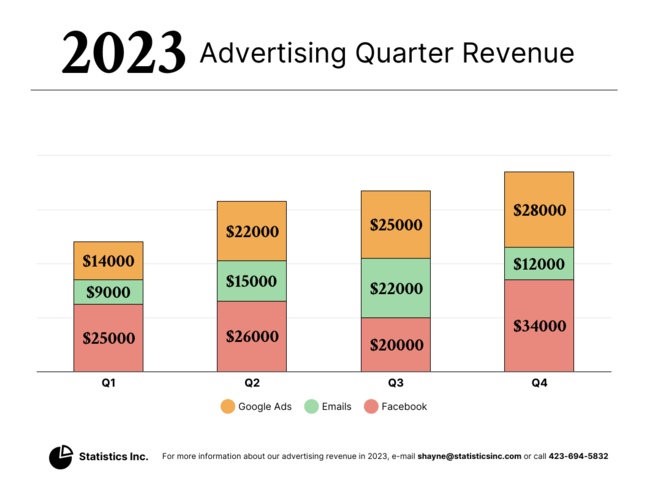
- Example Prompt: "Create a segmented bar graph showing the 2025 marketing budget for four departments: Sales, IT, HR, and R&D. For each department, segment the bar into 'Software', 'Staffing', and 'Events'."
-
Step 2: Trigger the Generation
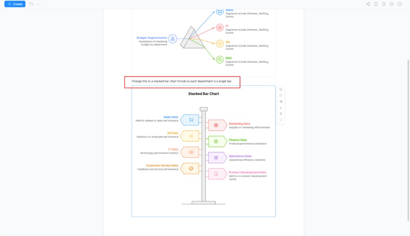
Highlight your text and click the or "Visualize" button. Diagrimo's AI analyzes the categories and values to automatically select the "Stacked Bar" template.

-
Step 3: Refine the Segments
If the AI interprets the data as a side-by-side (grouped) bar chart instead of a segmented one, use the AI Writing Assistant or a follow-up prompt:
- Refine Prompt: "Change this to a stacked bar chart format so each department is a single bar."
-
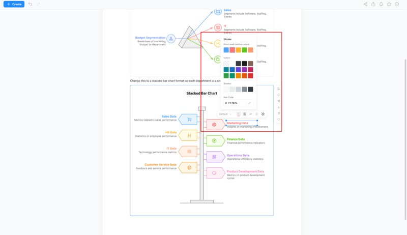
Step 4: Customize the Visuals
Use the Diagrimo editor to make the graph more readable:
- Color-Code: Click on specific segments to apply contrasting colors.
-
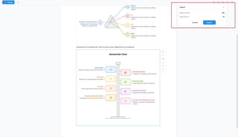
Step 5: Export for Your Report
Once finished, use the Export button to download the graph as a PNG for slides or a PDF for high-quality printing.
Using Diagrimo, you can quickly generate professional segmented bar graphs without complicated manual steps, making it perfect for students, analysts, marketers, and educators.


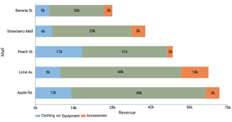
Segmented Bar Graph Examples
Here are a few simple examples to understand how segmented bar graphs work:
-
Survey Results by Department: Each bar represents a department, and segments show percentages of positive, neutral, and negative responses.
-
Quarterly Sales: Each bar represents a product, and segments show sales contribution from different regions.
-
Demographics: Each bar represents a city, and segments show male/female or age group proportions.
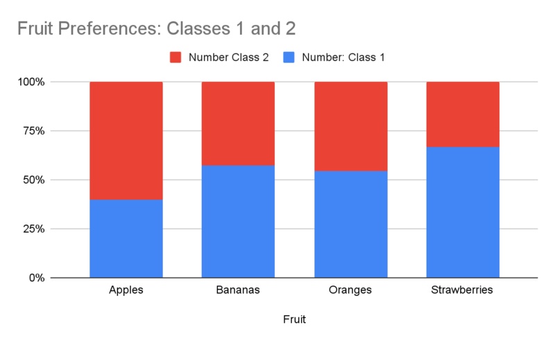


These examples show how segmented bar graphs make it easy to compare both overall totals and individual components at a glance.
Tips for Reading and Interpreting Segmented Bar Graphs
-
Look at each bar as a whole first, then check the segments.
-
Compare segment sizes across bars to identify trends or patterns.
-
Use the legend to understand which segment corresponds to which subcategory.
-
Pay attention to percentages or values inside segments for precise interpretation.
-
Avoid clutter: too many subcategories can make a graph hard to read.
Final Thoughts
A segmented bar graph is a powerful tool to visualize multiple layers of data in one chart. It helps compare categories and subcategories clearly, making analysis faster and easier. While you could create these manually in Excel or other software, Diagrimo simplifies the process with AI-powered templates, customizable segments, and easy export options. Whether you're preparing a report, presentation, or research, Diagrimo ensures your segmented bar graphs are professional, accurate, and easy to read.
- AI text-to-visuals turns ideas into diagrams or infographics.
- Customizable styles match your brand and presentation tone.
- Share anytime by exporting in various formats and a link.
- No design skills needed for presentations, teaching, or reports.

FAQs
-
What is a segmented bar graph and why is it used?
-
How is a segmented bar graph different from a mosaic plot?
-
How do I make a segmented bar graph online for free?
-
What are common mistakes when reading segmented bar graphs?
-
Can segmented bar graphs be used in presentations and reports?
A segmented bar graph is a type of bar chart in which each bar is divided into segments representing subcategories. It is used to compare both overall totals and proportions within each category.
A segmented bar graph shows segments stacked in bars of equal width, while a mosaic plot uses varying widths and heights to represent proportions. Segmented bar graphs are simpler to read and compare visually.
You can make a segmented bar graph online using tool like Diagrimo. This platform allow you to input data, generate a graph automatically, customize it, and export it for reports or presentations.
Common mistakes include ignoring segment proportions, misreading colors without checking the legend, comparing bars of unequal scale, or including too many subcategories, which can make the graph confusing.
Yes, segmented bar graphs are ideal for presentations and reports because they clearly show overall totals and subcategory contributions. Using tools like Diagrimo makes them visually appealing and professional.
