Have you ever needed a quick way to organize your thoughts when making a decision? That's where a T chart comes in handy. It's one of the simplest tools out there for breaking down ideas into two sides. People often use a T Chart example for compare and contrast tasks, like weighing pros against cons or similarities versus differences. In this article, we'll look at what a T chart is, share plenty of T chart examples for different situations, and show you how to make one easily.
What is a T Chart?
A T chart is a type of graphic organizer that looks exactly like the letter "T". You simply draw a horizontal line across the top and a vertical line down the middle to separate information into two groups.
The beauty of a T Chart is its simplicity. No fancy software is needed, just paper and a pen. It is widely loved by teachers and professionals because it is the most effective T chart example compare and contrast tool available. It allows you to place two different topics side by side to spot differences instantly.
To make one effective, you need to include these three basic elements:
-
The Title: This goes at the very top (above the horizontal line) and states the main topic you are analyzing.
-
The Column Headers: These are the labels for your two categories, such as "Pros vs. Cons" or "Before vs. After".
-
The Content: These are the specific details or bullet points listed inside the columns under the correct header.

A blank T chart looks like this:

Practical T Chart Examples for Real Life Use
Let's dive into some real T Chart examples. These show how flexible the tool can be.
1. T Chart Example for Life
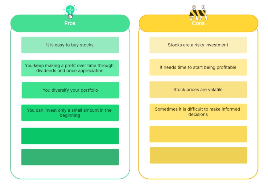
In daily life, a T Chart helps with personal decisions. For instance, when deciding whether to buy a new phone, you might label one side "Pros" and the other "Cons."

This simple T Chart example makes it clear if the upgrade is worth it.
2. T Chart Examples for Students
In the classroom, the T chart is a universal tool. It is not limited to a single subject or grade level. Whether a student is brainstorming for a history debate, organizing notes for a physics exam, or simply learning new vocabulary, this graphic organizer brings order to their thoughts.
Students use T chart example a lot to compare and contrast ideas. Here are a few specific ones.
1)T Chart Examples for Students reading
One of the most effective ways to teach literary analysis is by comparing character traits. Instead of just reading a story, students can use a chart to dissect the differences between the main characters. This helps them visualize the conflict and understand the roles of the "good guy" versus the "bad guy."

2)T Chart Examples for Math
Geometry can be confusing without visuals. For T Chart examples for math, moving beyond simple numbers to compare "2D Shapes" versus "3D Shapes" is incredibly powerful. This exercise helps students grasp the difference between flat objects and solid objects instantly.

3)T Chart Examples for Science
Biology often begins with classification. A fundamental T Chart examples for science lesson involves distinguishing between the biotic and abiotic worlds. By listing "Living Things" against "Non-Living Things," students learn to identify biological traits like growth, reproduction, and energy consumption.

4)T Chart Examples for Language
Expanding vocabulary is crucial for young writers. For T Chart examples for language, try comparing Synonyms and Antonyms of a common word like "Happy." This exercise pushes students to find more descriptive and precise words which improves their creative writing skills.

3. T Chart Examples for Business
Business moves fast, and managers often need to visualize trade-offs instantly. A T Chart is the perfect tool for this because it strips away the noise and focuses on the core comparison.
A classic T Chart example for business is the "Make or Buy" decision. When starting a new project, a team must decide whether to build the solution with their own employees or hire an outside agency. Listing the factors side by side makes the most cost-effective choice obvious.

4. T Chart Examples for Accounting
This is a unique category. While other charts compare qualitative ideas, t chart example accounting formats are used strictly for numbers and balancing. In the finance world, these are known as "T-Accounts."

The logic here is specific: the left side is always for Debits, and the right side is always for Credits. It is the fundamental building block of the double-entry bookkeeping system.
How to Make a T Chart Easily?
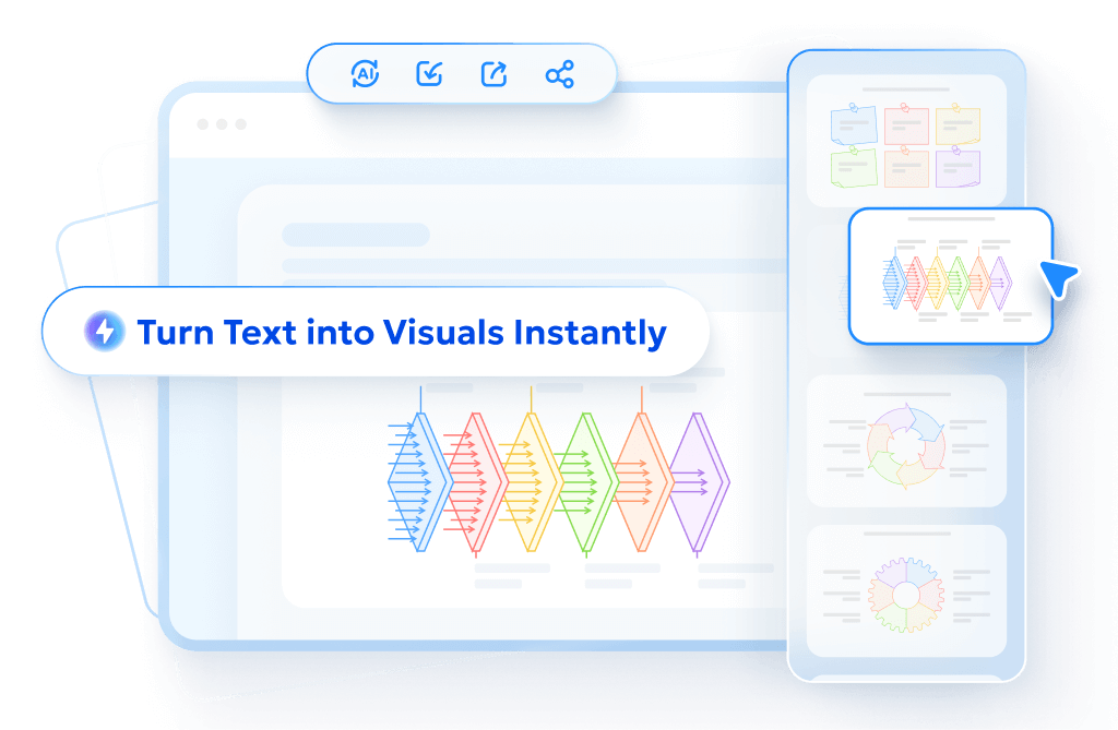
You could sketch a T Chart on paper, but Diagrimo offers a much smarter way to visualize your thoughts. This innovative tool acts as your personal designer by converting simple text directly into visual charts. There is no need to start from a blank canvas or worry about alignment. Just input your content and watch as Diagrimo organizes it into a clear and structured T Chart for you.

Here are the simple steps to make a T chart:
- Go to the Diagrimo website and start a new diagram.
- Enter your content in text form. Simply type the ideas you want to compare, such as two sides of a topic.
- Click the generate button, and Diagrimo will turn it into a clean Chart with one click. You can tweak colors or layout as you want.
Key Features of Diagrimo
- Text to chart conversion: Just type your ideas in plain text, and Diagrimo turns them into a clear T Chart automatically.
- Smart chart suggestions: If a T Chart is not the best fit, Diagrimo can suggest other chart types that match your content.
- One click generation: You can create a complete chart in seconds without setting up rows, columns, or layouts.
- Easy customization: Colors, spacing, and layout can be adjusted easily, even if you have no design experience.
- Beginner friendly workflow: You do not need to start from zero. Diagrimo helps you go from idea to visual in one simple flow.
Tips for Creating an Effective T Chart
To get the most out of your diagram, keep these simple rules in mind to ensure your analysis is clear and useful:
Conclusion
A T Chart is a timeless tool that's easy to use and incredibly helpful. Whether you're a student comparing ideas, a business person making choices, or just sorting out daily life, these T Chart examples show how it fits everywhere.
If you want to create one quickly without starting from scratch, Diagrimo text to visual tool makes it easy by turning your text into a clean T Chart or other helpful diagrams in just a few clicks. Give it a try next time you need clarity. You might be surprised how much it helps!
- AI text-to-visuals turns ideas into diagrams or infographics.
- Customizable styles match your brand and presentation tone.
- Share anytime by exporting in various formats and a link.
- No design skills needed for presentations, teaching, or reports.
FAQ
Q: What is a T chart used for?
Q: What is a t-chart in math?
-
Q: What is the difference between a T Chart and a Venn Diagram?
Q: Can a T Chart have more than two columns?
-
Q: Should I draw a T Chart by hand or use software?
A: A T Chart is used to organize information into two clear groups. It is most commonly used to compare and contrast two topics, such as listing pros and cons for a decision. It also helps people separate facts from opinions or problems from solutions.
A: In math, a t-chart is often used as an input and output table to show relationships between numbers. For example, the left column might list "X" values while the right column lists "Y" values. This helps students organize data to solve equations or find patterns.
A: This is a common question. A Venn Diagram is best used for showing where things overlap or share similarities. However, a T Chart example compare and contrast format is superior for clearly listing differences side by side. If your goal is to show contrast, the T Chart is the better choice.
A: Technically, a standard T Chart gets its name from having two columns divided by a line. If you add a third column (for example, "Pros," "Cons," and "Neutral Points"), it becomes a multi-column chart. However, the organizing principle remains the same.
A: For a quick personal thought, a pen and paper are fastest. But for school assignments or professional presentations, using a digital t chart maker like Diagrimo is better. It allows you to edit, save, and share your work cleanly without messy handwriting.
